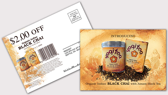
Back in 2007 I was buying a lot of Yogi Tea, but it looked terrible in the cabinet so I wanted to explore solutions to the design problem myself. (The Yogi Tea company launched the "henna" rebrand right around the time I was working on this project. It was good to see that they also knew their product was misrepresented by their old designs.)
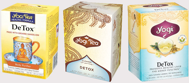
The existing Yogi Tea packaging.
2007 2008 2009
I also knew enough about the tea quality and the company's history (of actually being based on the tea a yogi served his students) to know it shouldn't look anything like Celestial Seasonings, which it did. It needed to make that direct connection between the culture of origin and the receiver, and look steeped (pun intended) in history and culture to attract a more discerning tea consumer.
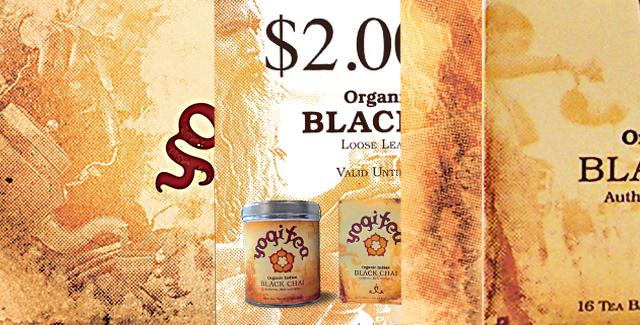
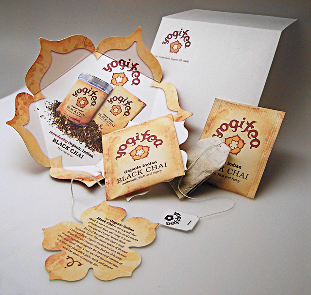
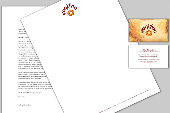
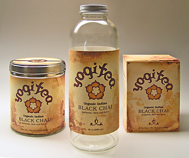
I went for natural but distinct colors that look like they came from tea stains. Each tea's packaging uses a natural stain color spectrum from that variety of tea. Faint imagery in the background hints at the history of the variety. For instance, in the images below, the Black Chai tea packaging, collateral, and marketing show faint images of cultures where Black Assam Tea and Chai Tea originate or are the most common. Other varieties would have tailored imagery. Echinacea, for instance, was a Native North American Plains Indian herb and would feature faded imagery from that culture. A countryside remedy mix tea could certainly have the faded images be of the preparation of those ingredients and those landscapes and peoples.
I went for natural but distinct colors that look like they came from tea stains. Each tea's packaging uses a natural stain color spectrum from that variety of tea. Faint imagery in the background hints at the history of the variety. For instance, in the images below, the Black Chai tea packaging, collateral, and marketing show faint images of cultures where Black Assam Tea and Chai Tea originate or are the most common. Other varieties would have tailored imagery. Echinacea, for instance, was a Native North American Plains Indian herb and would feature faded imagery from that culture. A countryside remedy mix tea could certainly have the faded images be of the preparation of those ingredients and those landscapes and peoples.
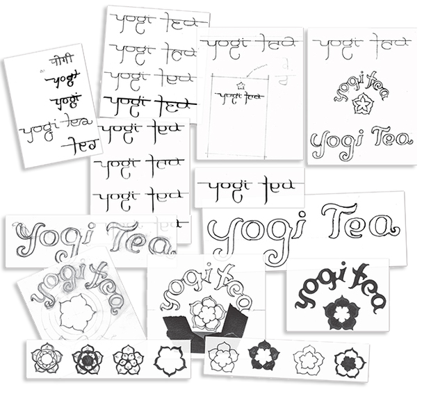
explorations

textures, background images, collateral, packaging