This page is under construction.
Thank you for your patience.
Thank you for your patience.
For three years I worked on the Microsoft Excel team (FTE) as a UX Designer. I joined the team after becoming the Azure team data visualizations expert for their portal tiles. I knew Excel would offer ample opportunities to grow those skills, and it delivered. In addition to charting improvements, I worked on a wide variety of Excel features. See more details about my time at Microsoft on my work experience page.
Conditional Formatting Rules; Modernizing and improving
Porting features: reaching parity between Excel desktop and Excel Online while modernizing and improving.
Conditional formatting is a core feature in Excel that a huge segment of the population utilizes frequently, if not every day for their jobs. During the porting of the feature into Excel Online, dialogs needed to become taskpanes, and there were many opportunities to add ease of use and functionality. I utilized cards to create rules that could be easily seen, managed, edited, and sorted.
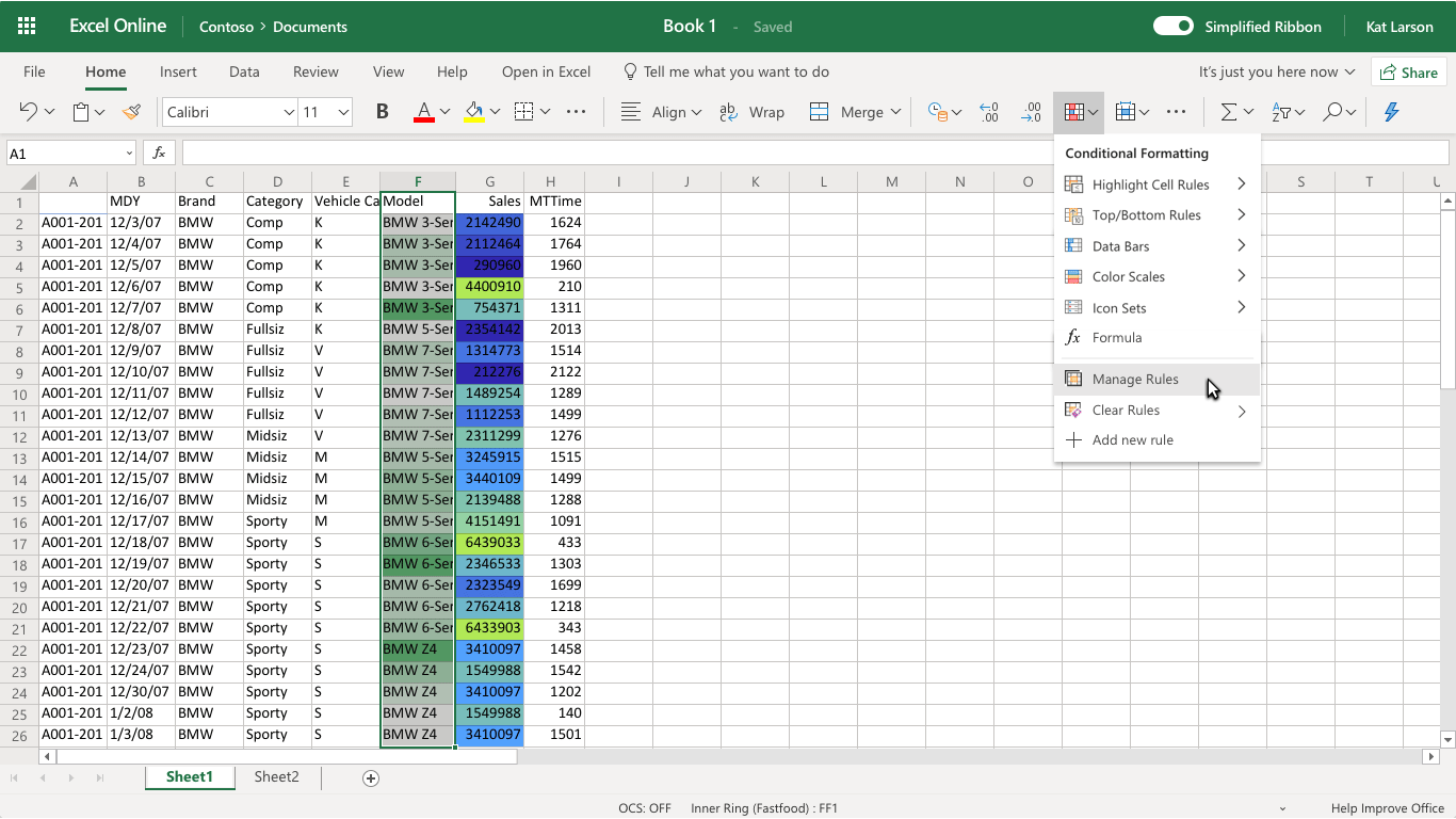
Below, see additional UX improvements and a disable feature I proposed to the team. A disabled state would allow people in the same company to share a master file with all the conditional formatting and each department or contributor could disable whatever they don't need at any given time, saving time and eliminating duplication of menial tasks. It would also allow for MUCH easier data exploration to enable and disable rather than create and delete.
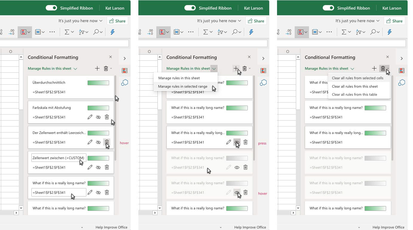
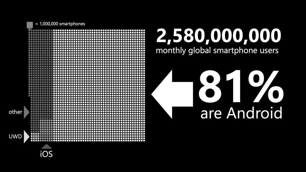
Excel research storytelling
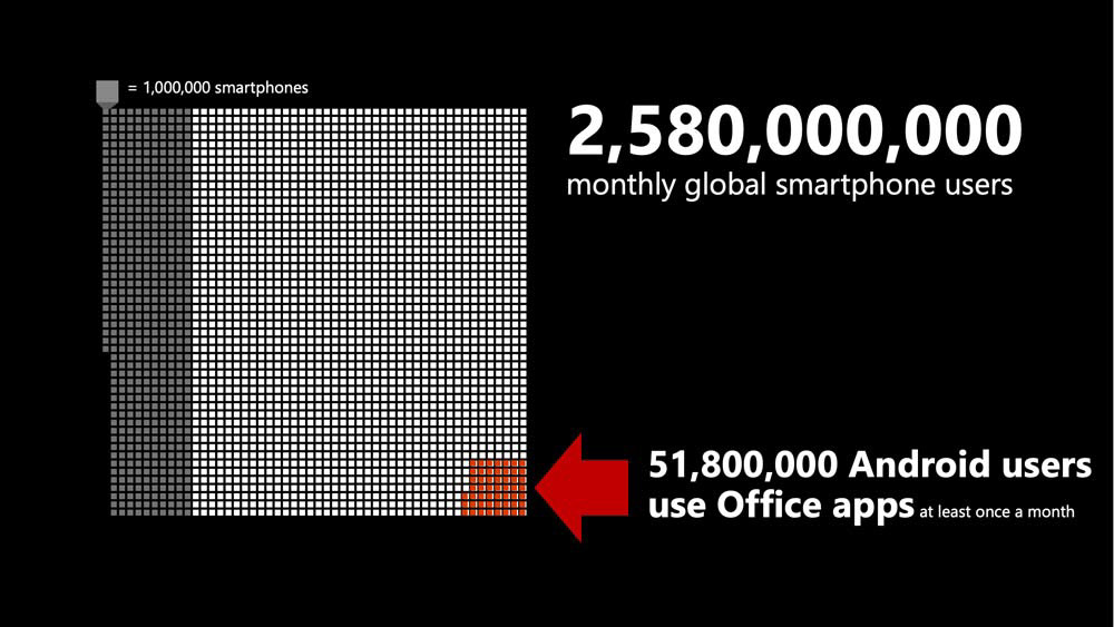
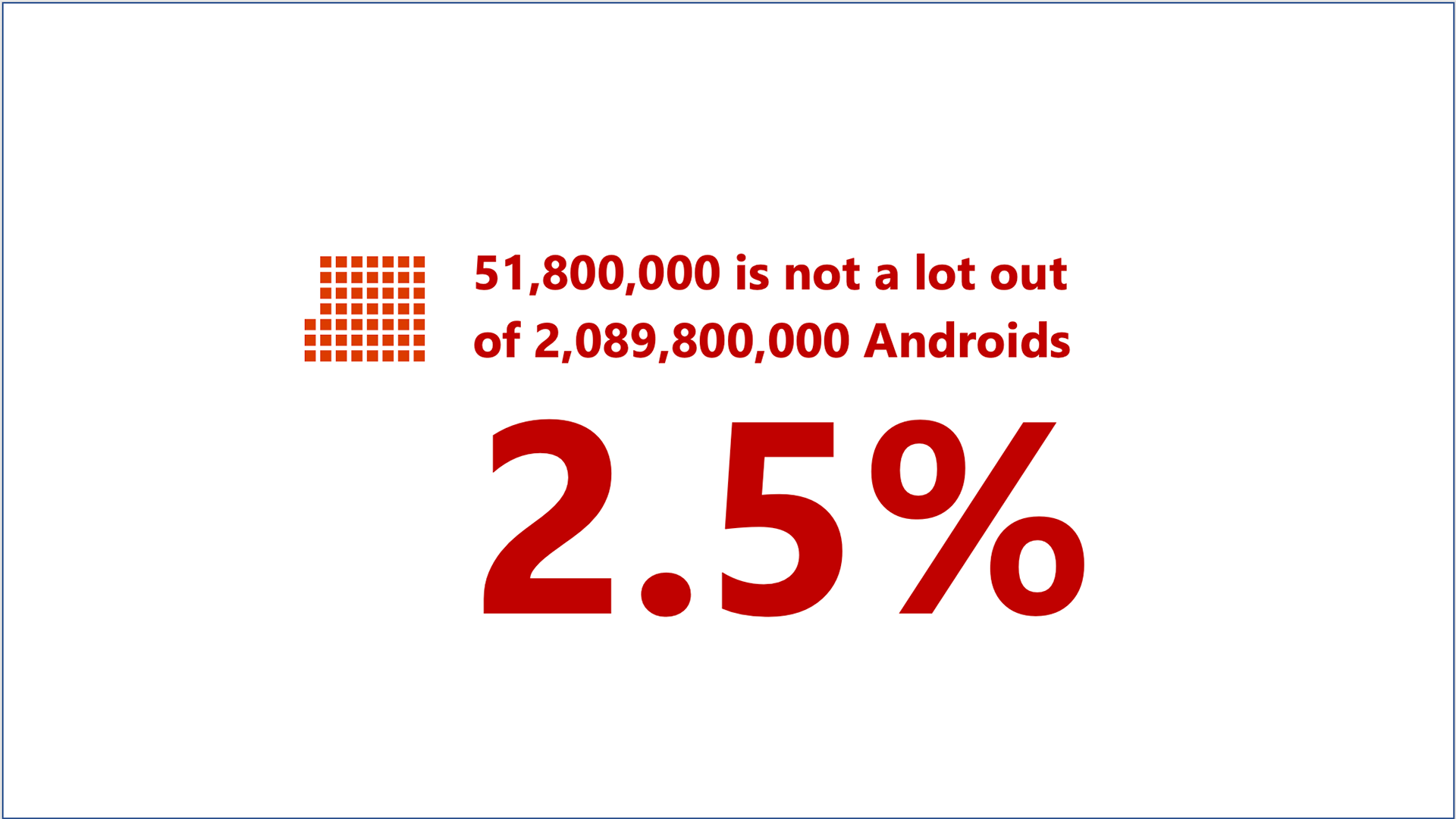
I worked on team awareness campaigns with Excel researchers to tell the story of issues affecting Excel use, such as global mobile dominance, Android platform dominance, and authentication drop-off rates, so that executives and other leads could make the best decisions for project prioritization and resources. We would begin by sorting through Excel's data and then researching accurate statistics for missing pieces of the important stories. These graphics below were created for presentations.
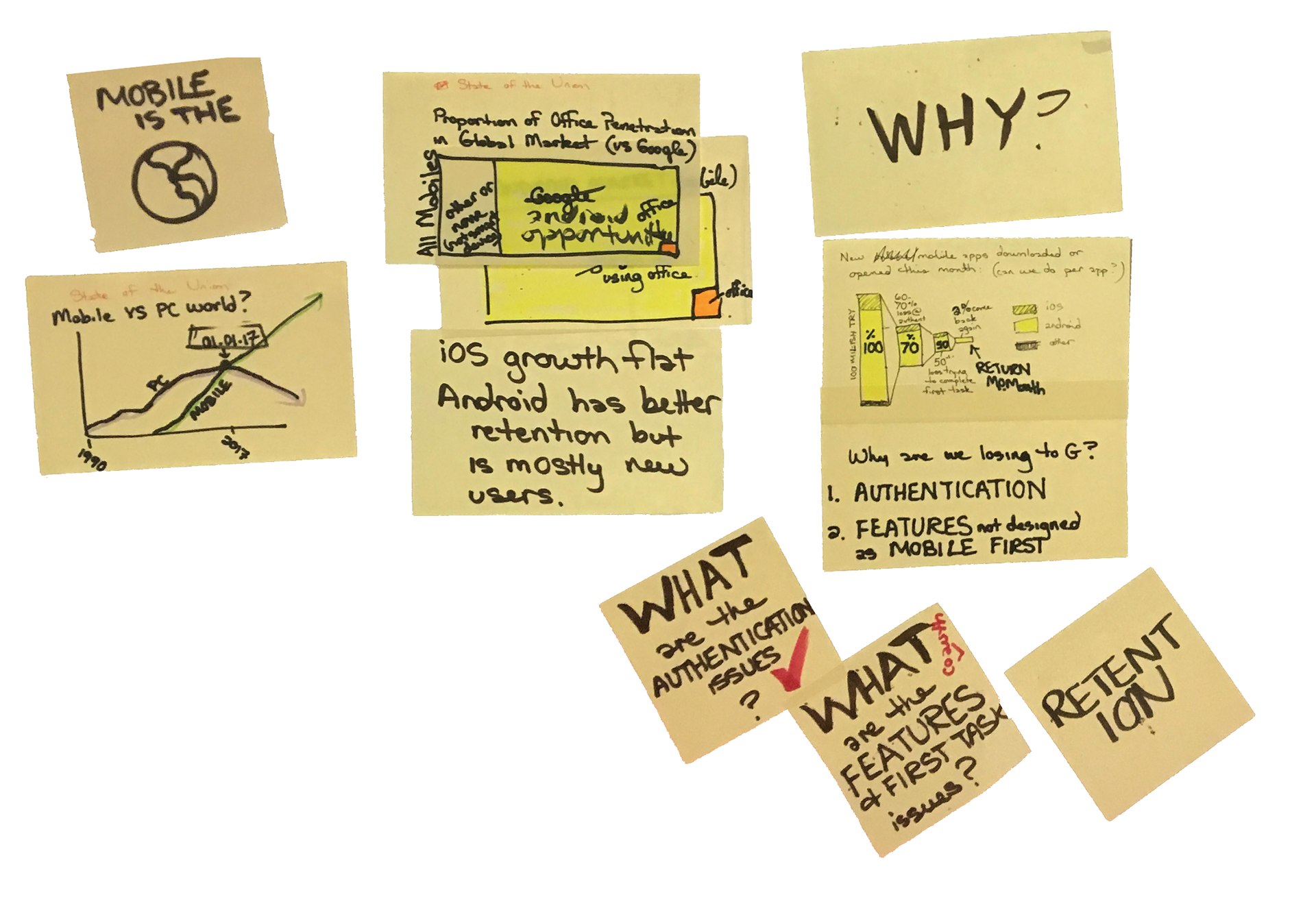
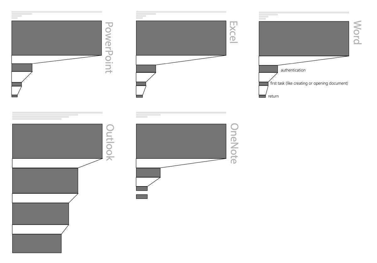
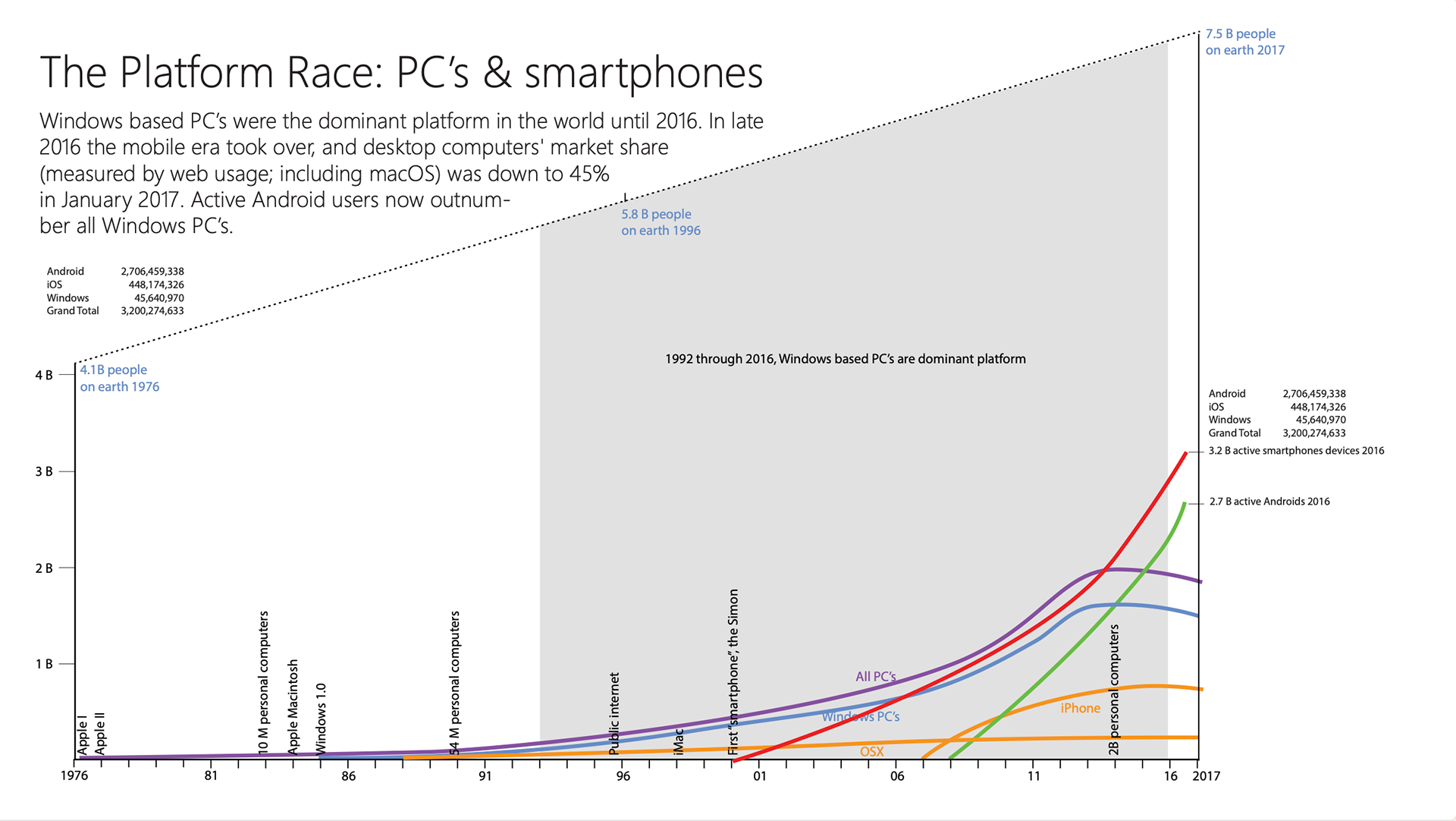
From this incredible view of the data we could make our case that the team resources needed reprioritized. The bias of the demographics working for Excel in the USA was toward developing for iPhone.


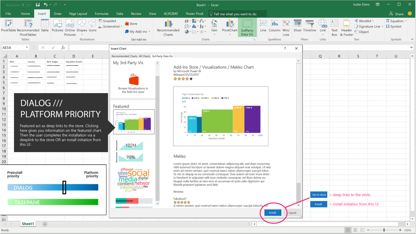
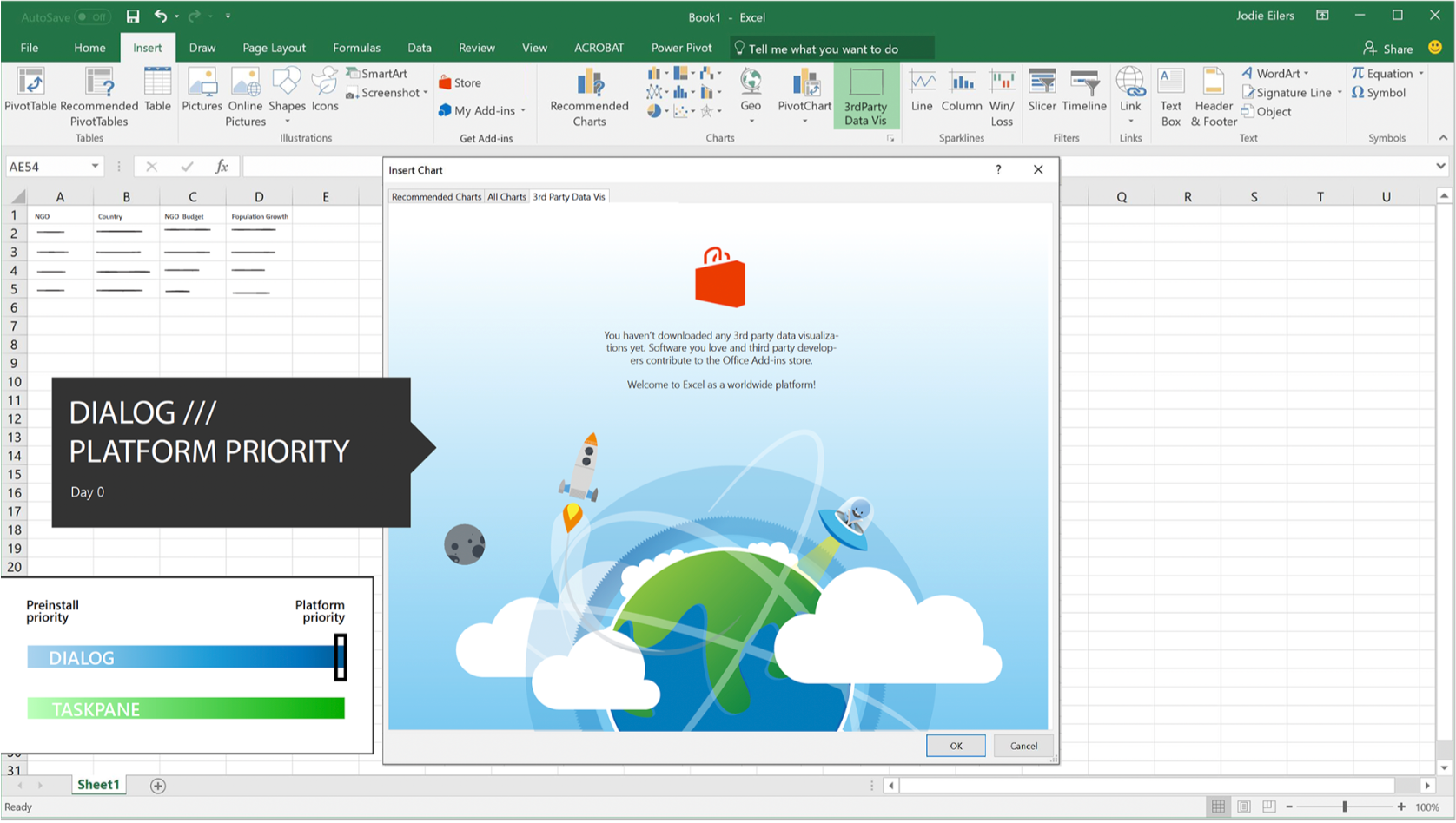
Excel as a platform: Power BI data vis integration
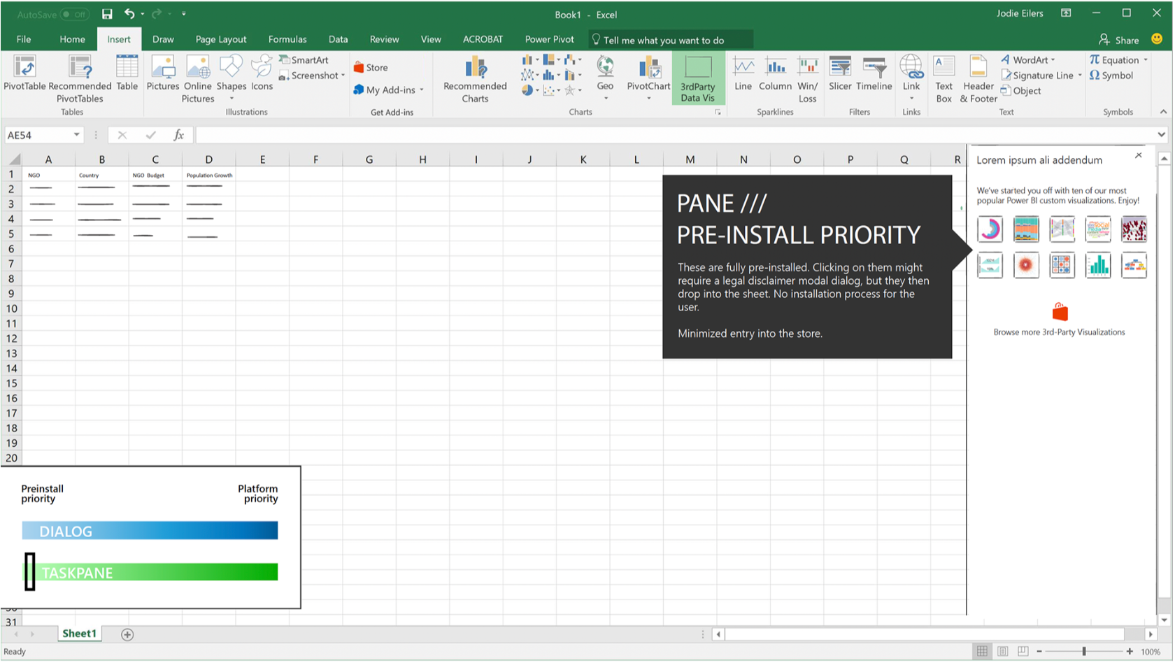
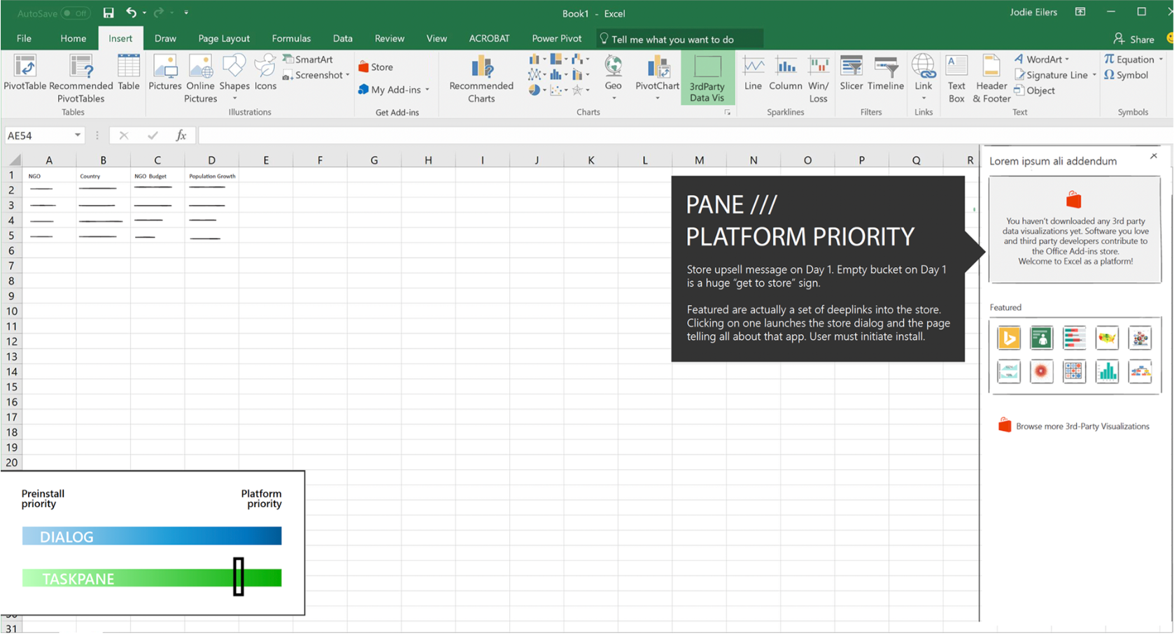
The team knew from the shift of tides in technology that if we didn't learn to play well with other products people used in their task ecosystems Excel would continue to become antiquated technology people would begrudgingly use instead of gravitate toward. Instead of keeping people stuck in the product and not playing well with other systems, we started to investigate "Excel as a platform." This meant opening up areas for developers to contribute in easier and more meaningful ways. In charting, that meant allowing more hooks into functionality for developers wanting to contribute visualizations to the ad-ins store, and making it easier for users to discover these additions. I started by working with the Power BI team to create some best-case examples of their visualizations for use in Excel. My explorations had to encompass a wide spectrum of options: both dialog box and taskpane patterns, pre-installing vs making the user go to the store, and challenging engineers to make add-in visualizations suggestible based on the user's data. Below are just a few mocks created for discussion.
This page is under construction.
Thank you for your patience.
Thank you for your patience.