From 2012–2014 I worked on the design and implementation of data visualizations in the Microsoft Azure Portal. This worked developed out of 'live-tile' content I was already doing: pages (blades) could be pinned to a start board (dashboard) and customized to eight tile sizes with content and layout adjusted and prioritized for each size. The charting followed suit.
I became the Azure team data-vis expert nearly by accident, and subsequently fell in love with the world. I devoured Edward Tufte info and met incredible experts as I raced to take advantage of available company resources for a field I had not studied to meet impending deadlines.
This then became became a wider interest in increasing the connections between data visualization experts at Microsoft, bringing exposure to existing Microsoft data best practices and resources, and furthering data visualization discussions across the divisions and products.
I did very practical data visualization design for the tightly-scoped but complicated Azure implementation, consultation with other design teams on-boarding partners, and did far-reaching data-visualization explorations for work with Microsoft branding team.
In 2016 I moved to the Excel team to work on data visualization solutions, and helped to implement charting in the online Excel experiences.
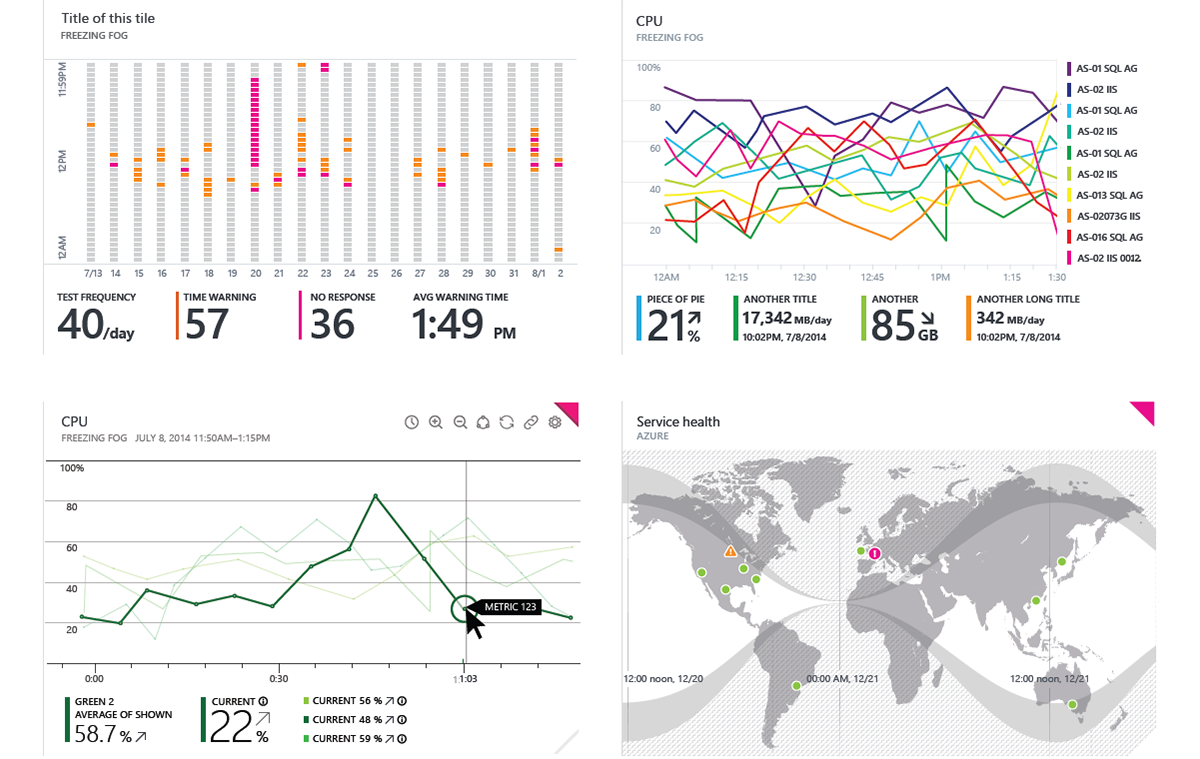
(You can hear the clicks if you turn the sound up on the video.) Many thanks to Ben Erickson, Microsoft video guru, who stitched these interaction explorations together in video for me (both videos below). You are looking at a zoomed-in view of the hero-wide tile size on the start-board (dashboard) of the Azure Portal (placeholder data).
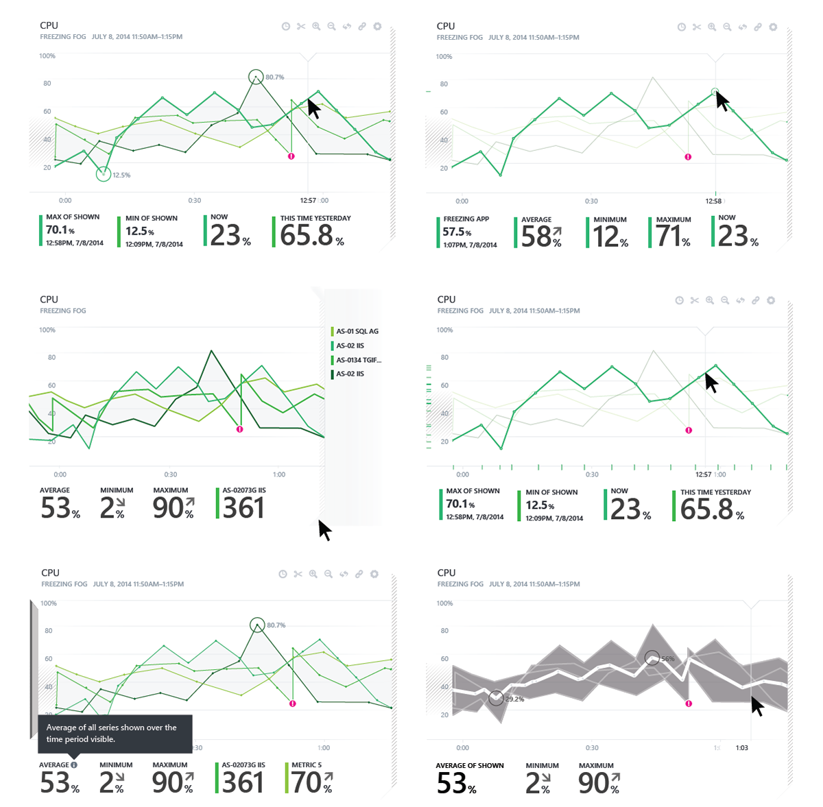
Explorations for Azure Portal monitoring across services, across the same timeline.

Legend and metrics exposure exploration for Azure Portal monitoring dashboard.
Explorations for hover and activation states on pie charts for the Azure Portal monitoring dashboard. See the video at the top of the page.
Explorations for hover and activation states on pie charts for the Azure Portal monitoring dashboard.
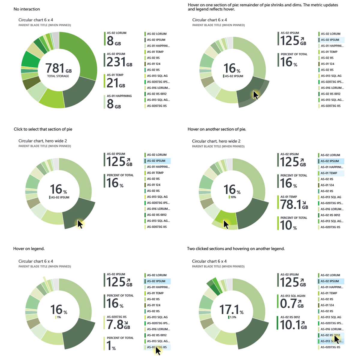
Explorations for hover and activation states on pie charts for the Azure Portal monitoring dashboard.
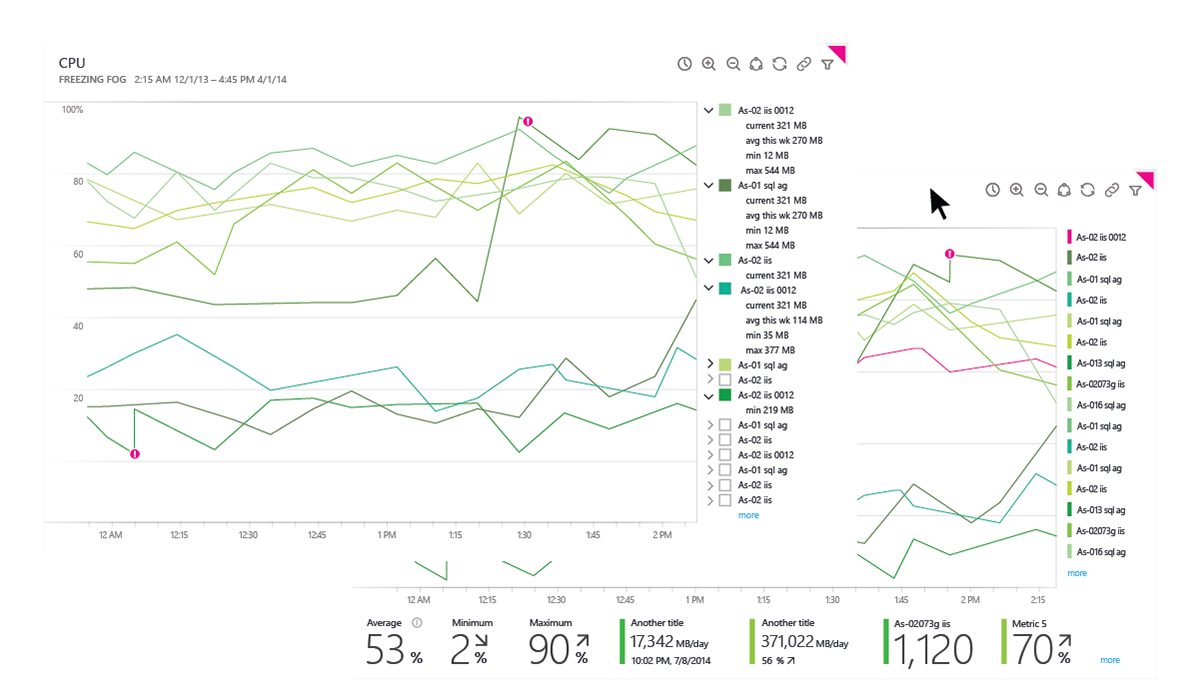
Explorations for visualizing thresholds and capacity for time-based Azure Portal monitoring systems, including hover and active states, on the largest tile sizes.
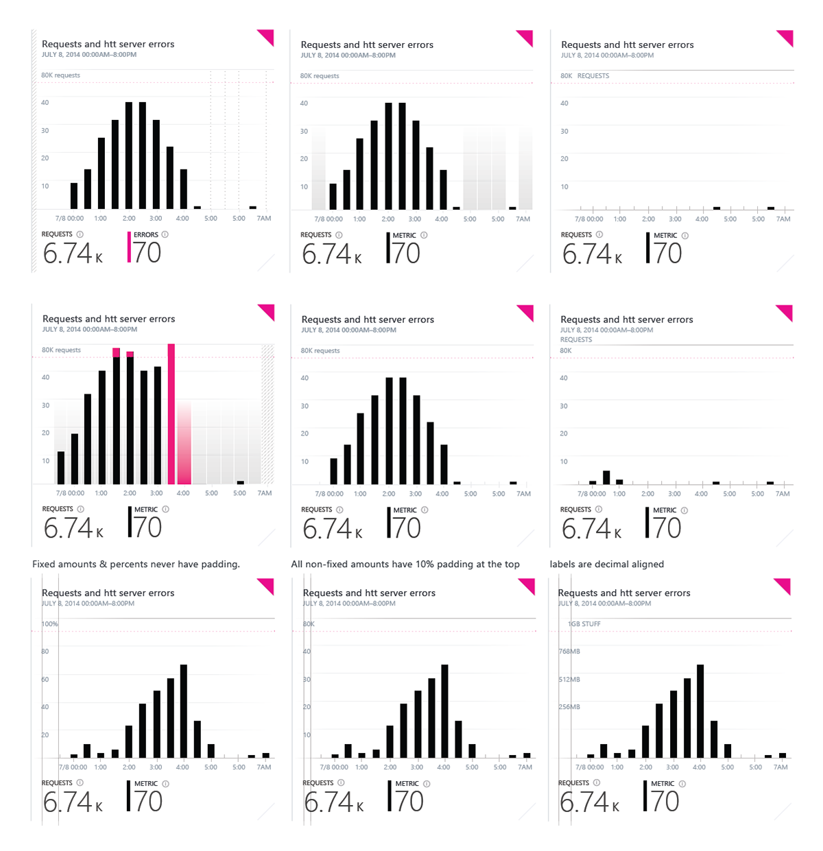
Explorations for visualizing different error and functionality states and thresholds for time-based Azure Portal monitoring systems.
Exploration for Azure Portal monitoring data-visualizations for billing.

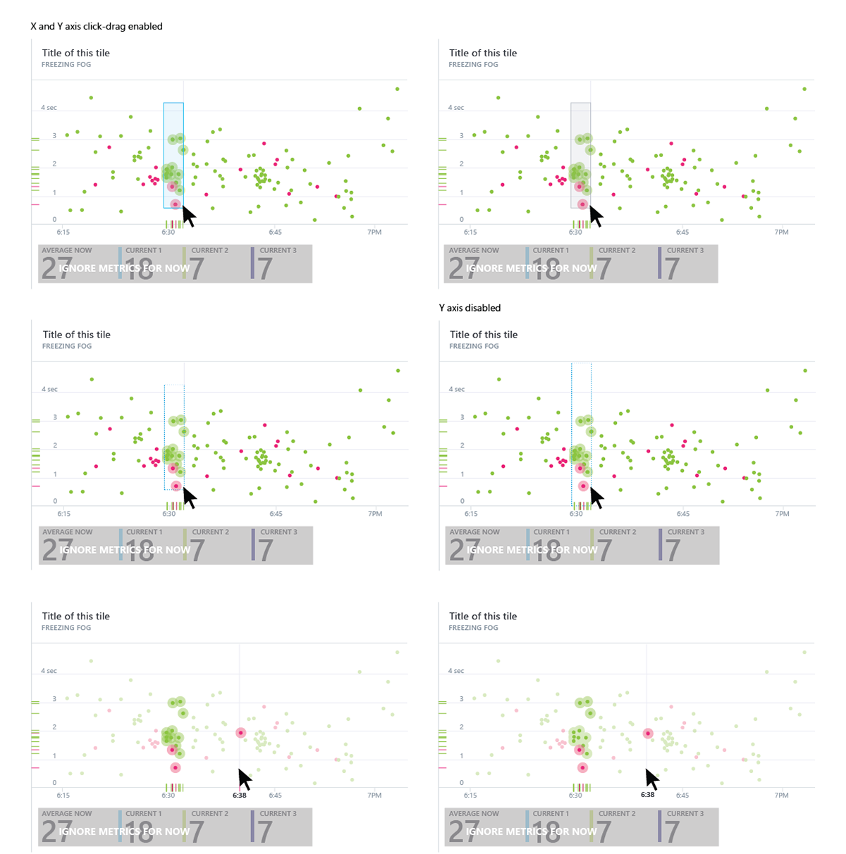
Explorations of manual range selection in the Azure Portal monitoring data-visualizations.
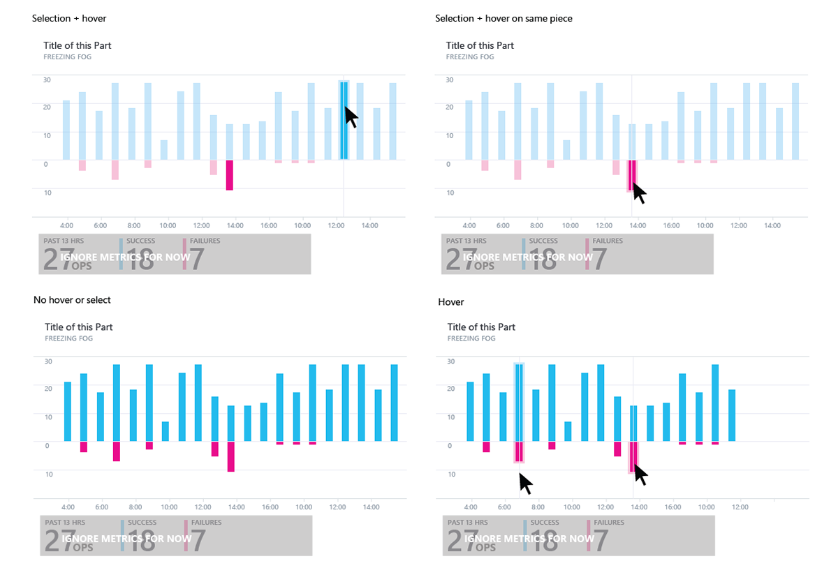
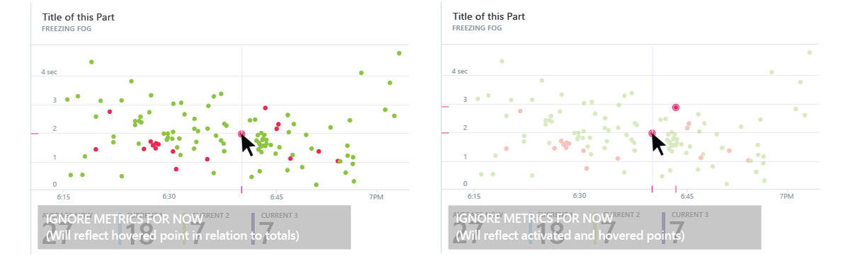
Exploration of hover and activation of points in Azure Portal monitoring data-visualizations.
Exploration of time-range selection in Azure Portal monitoring data-visualizations.
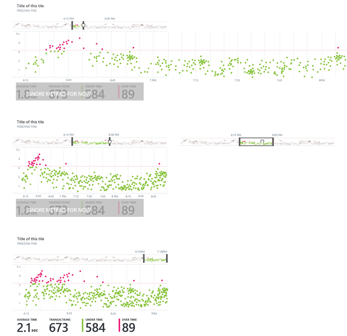
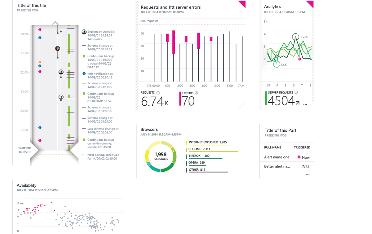
Exploration of various Azure Portal monitoring data-visualizations in the largest tile size.
Exploration of various Azure Portal monitoring data-visualizations in different tile sizes.
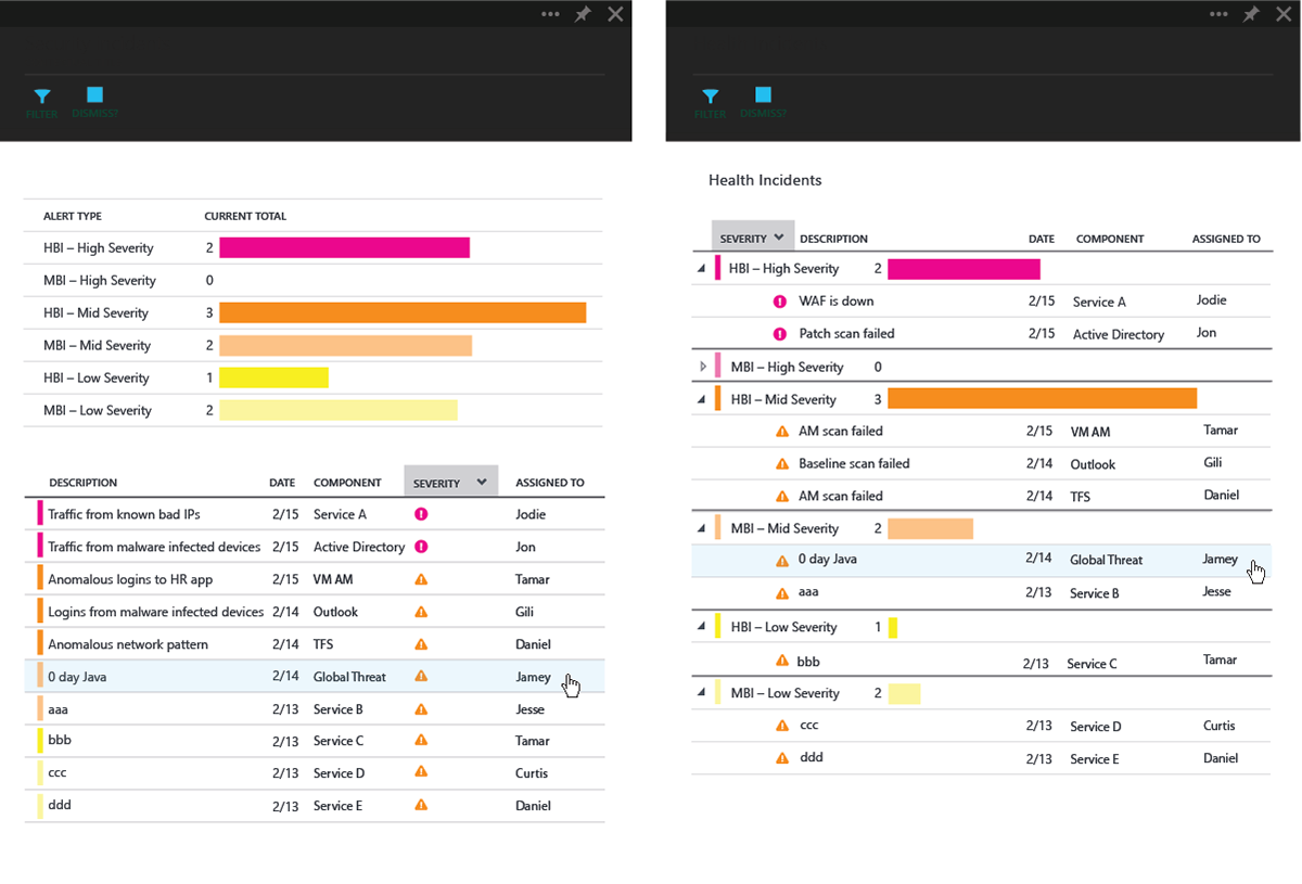
Exploration of grids containing visual indicators of quantitative and qualitative information.
Explorations of data bars in grids/tables for the Azure portal.
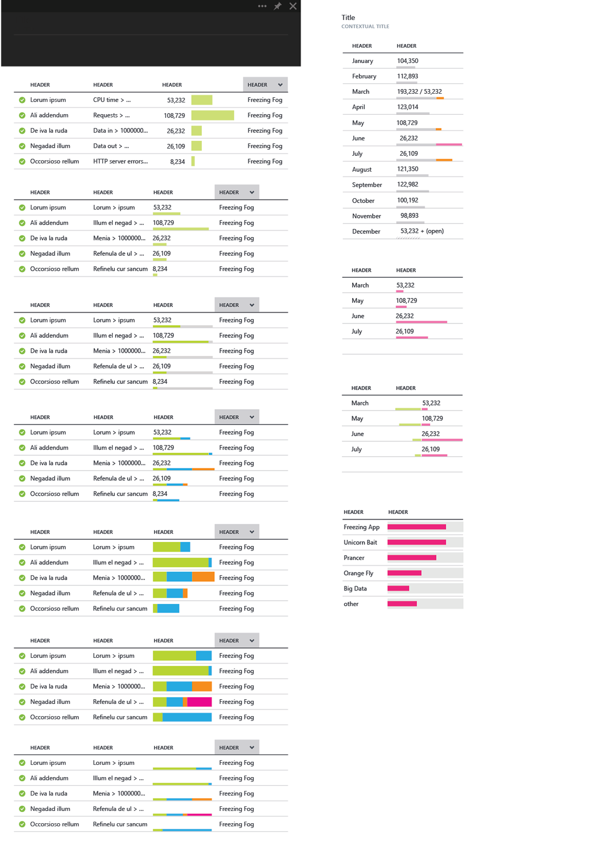
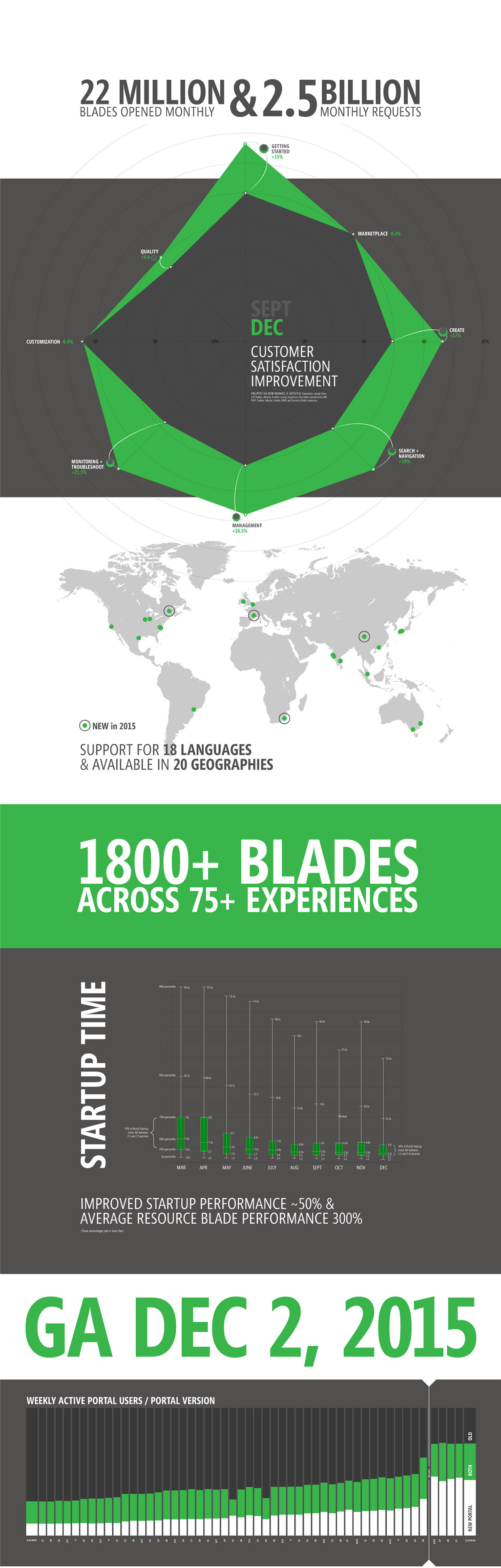
Below is a series of data visualizations created for a presentation at Azure Info Day at Microsoft to communicate success metrics to the larger team after a huge beta and MVP release of product.
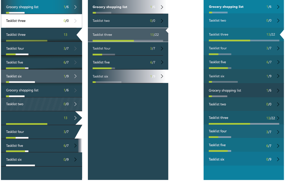
Explorations for a tasklist app for Power Apps at Microsoft, utilizing different visuals to show amount completed over total, and or status within total.
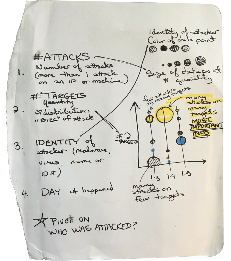
Scratch notes on some of the more complex monitoring needs in the Azure portal, allowing for 3-4 visual variables over a timeline.