Startup design needs
GeneSavvy was an early‑stage startup when I joined the team. I love working with startups and helping them reach their goals despite budget constraints, lean teams, and constant change—it keeps things interesting, and I get to wear a lot of hats. GeneSavvy already had a bright, playful brand that needed more gravity and credibility without losing its approachability. I started with a brand audit: reviewing existing materials, talking with core team members and clients, mapping major competitors, and digging into GeneSavvy’s unique value proposition (including a deep dive into some fairly technical genetics concepts).
Priority projects
Our priority projects included: refining the website without changing the underlying theme, designing UX for a new portal where doctors and clients could collaborate around GeneSavvy data, and redesigning the main auto‑generated technical report that outlined findings and potential action items for clients. We also needed clear guidelines and content for social media, conferences, and other marketing efforts—including a suite of technical illustrations.
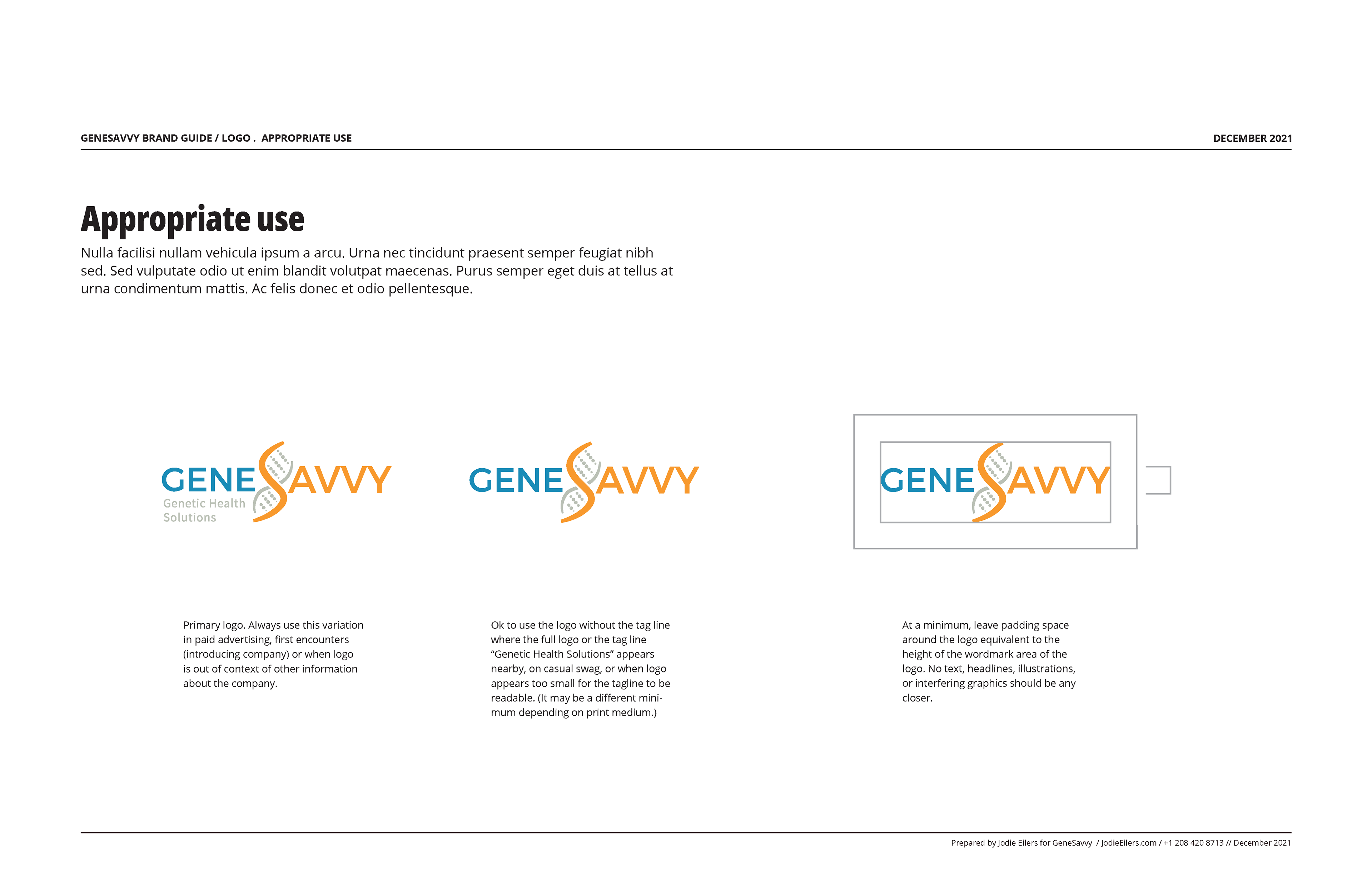
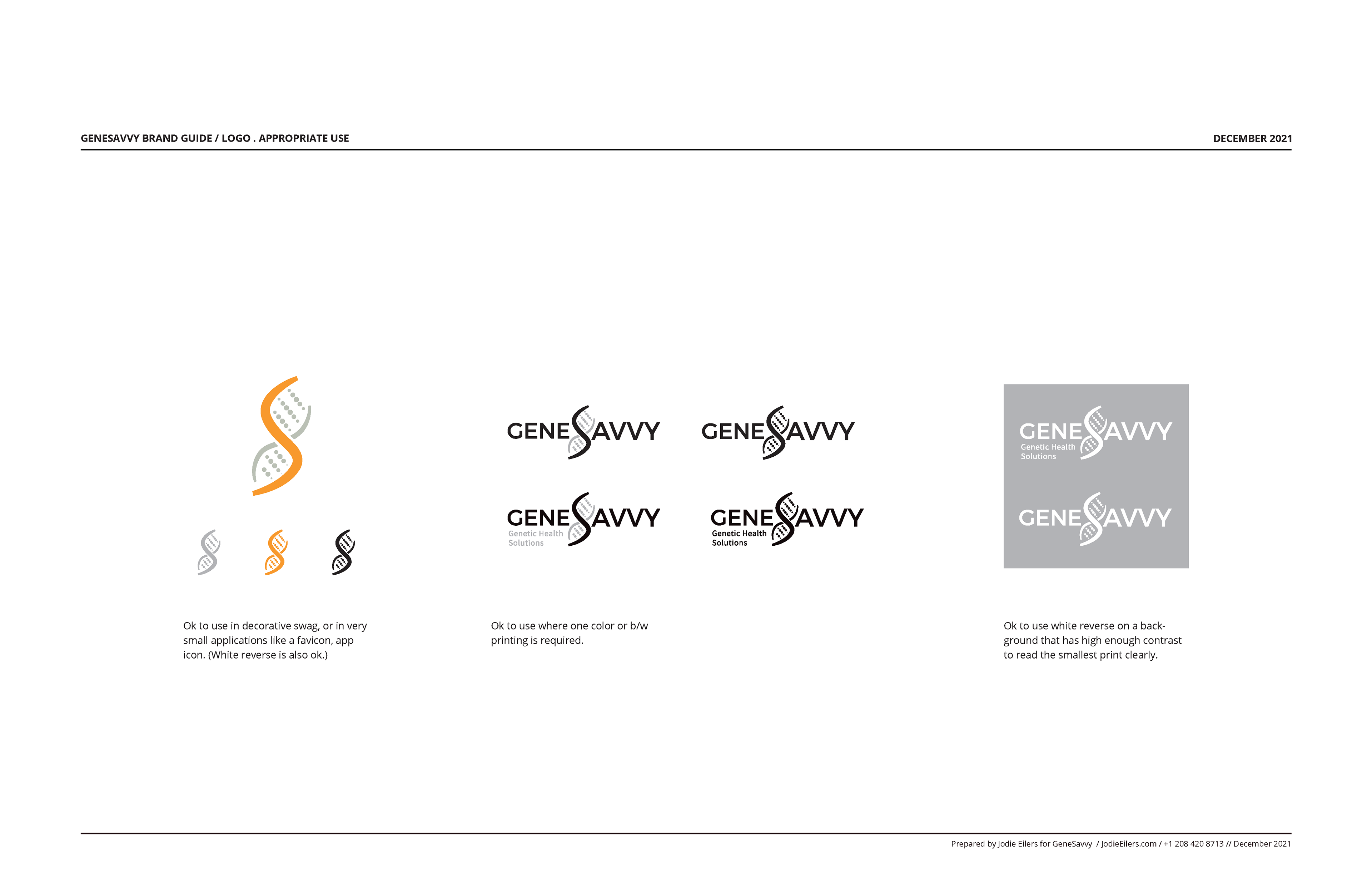
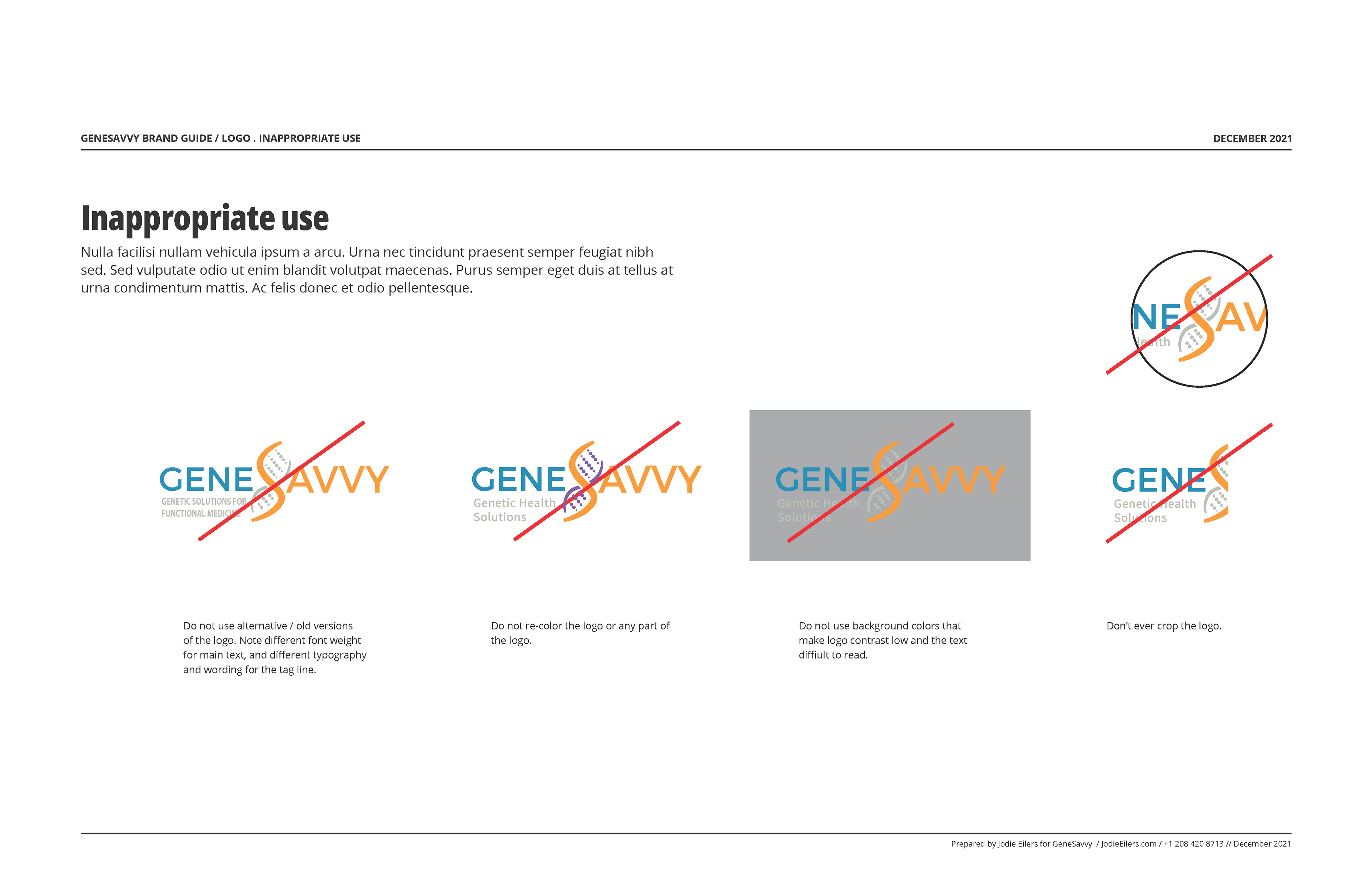
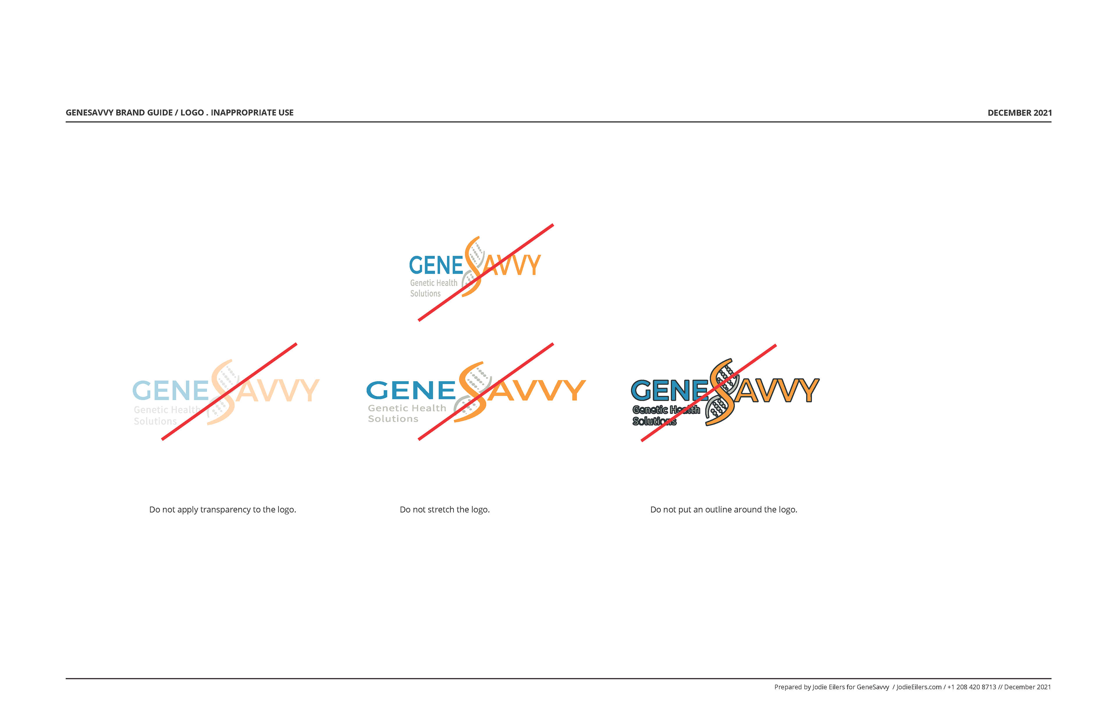
Brand Guidelines
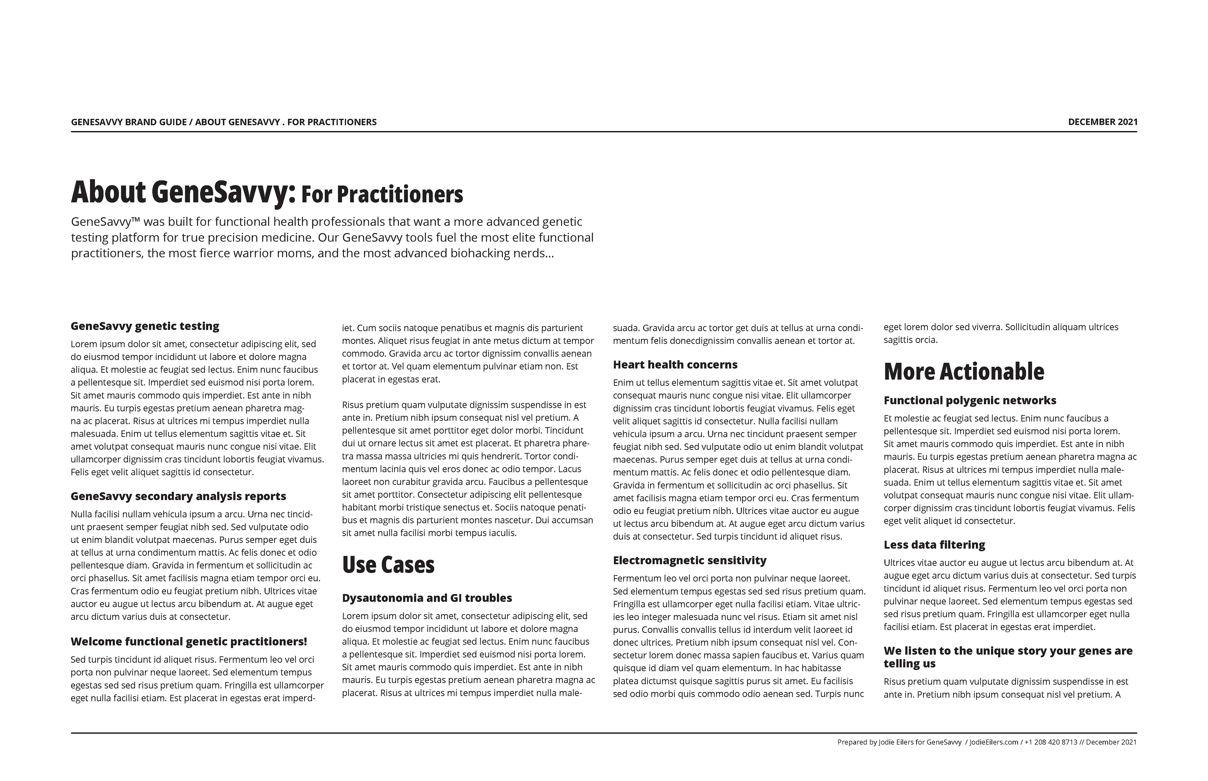
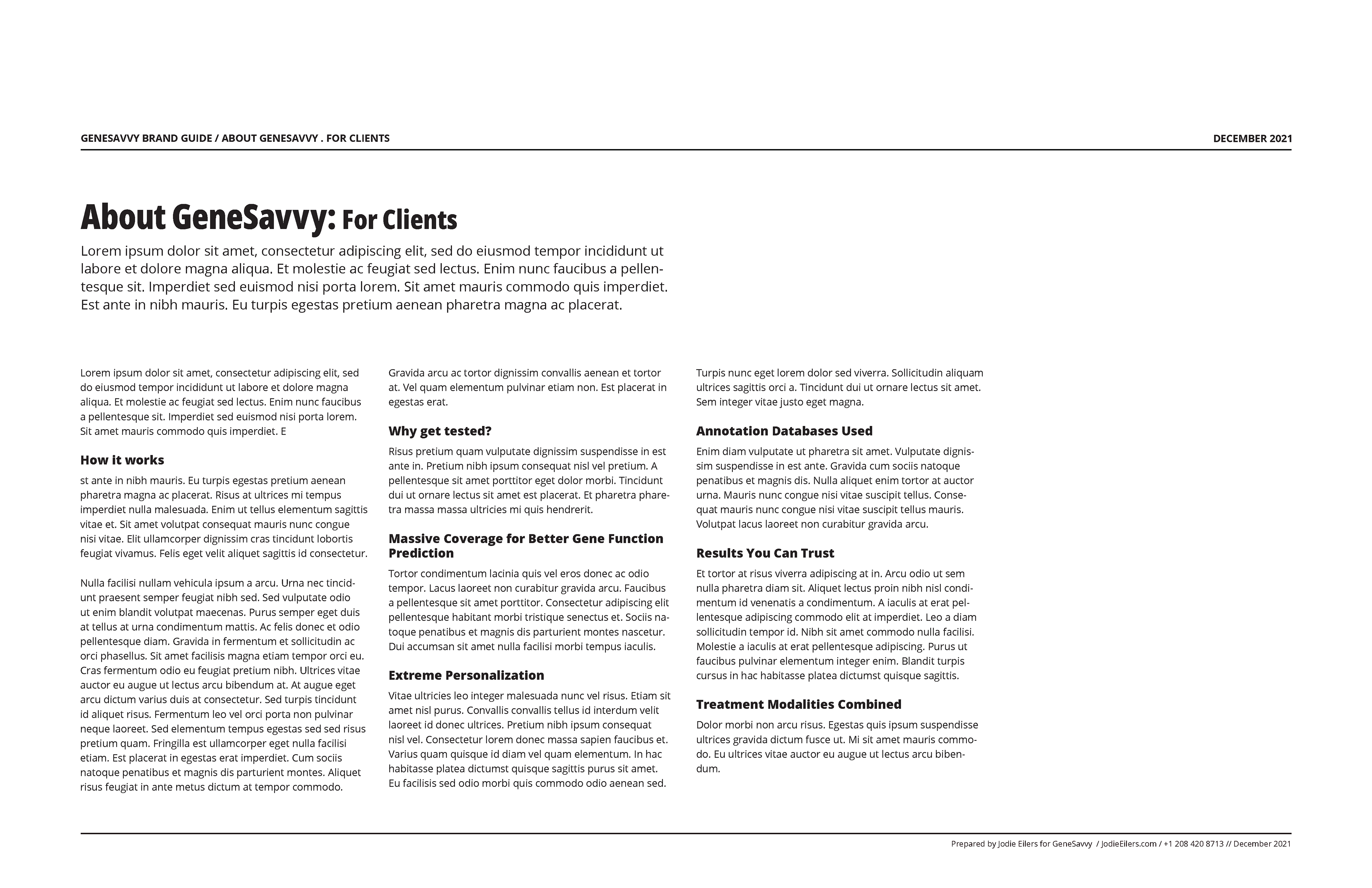
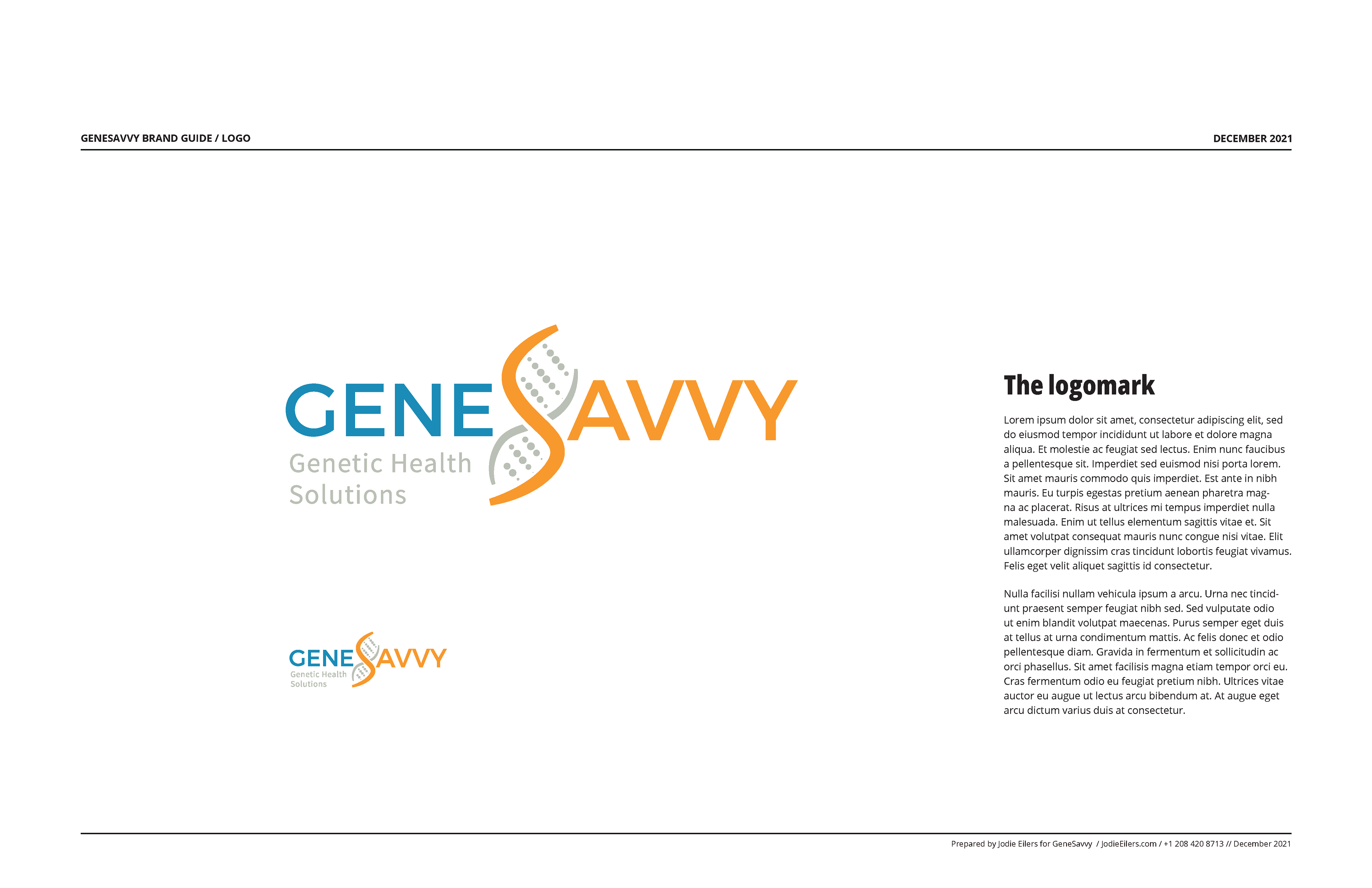
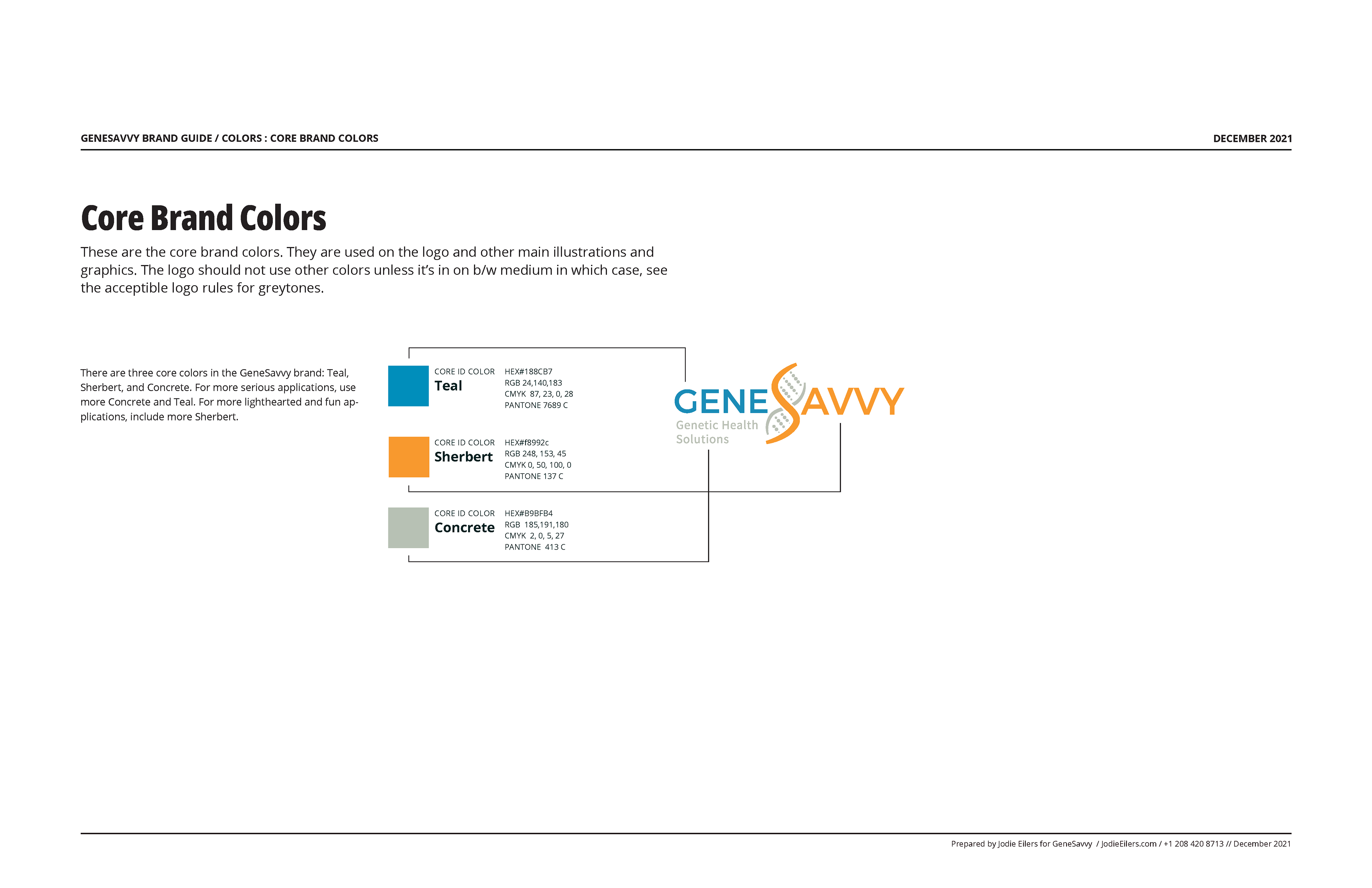
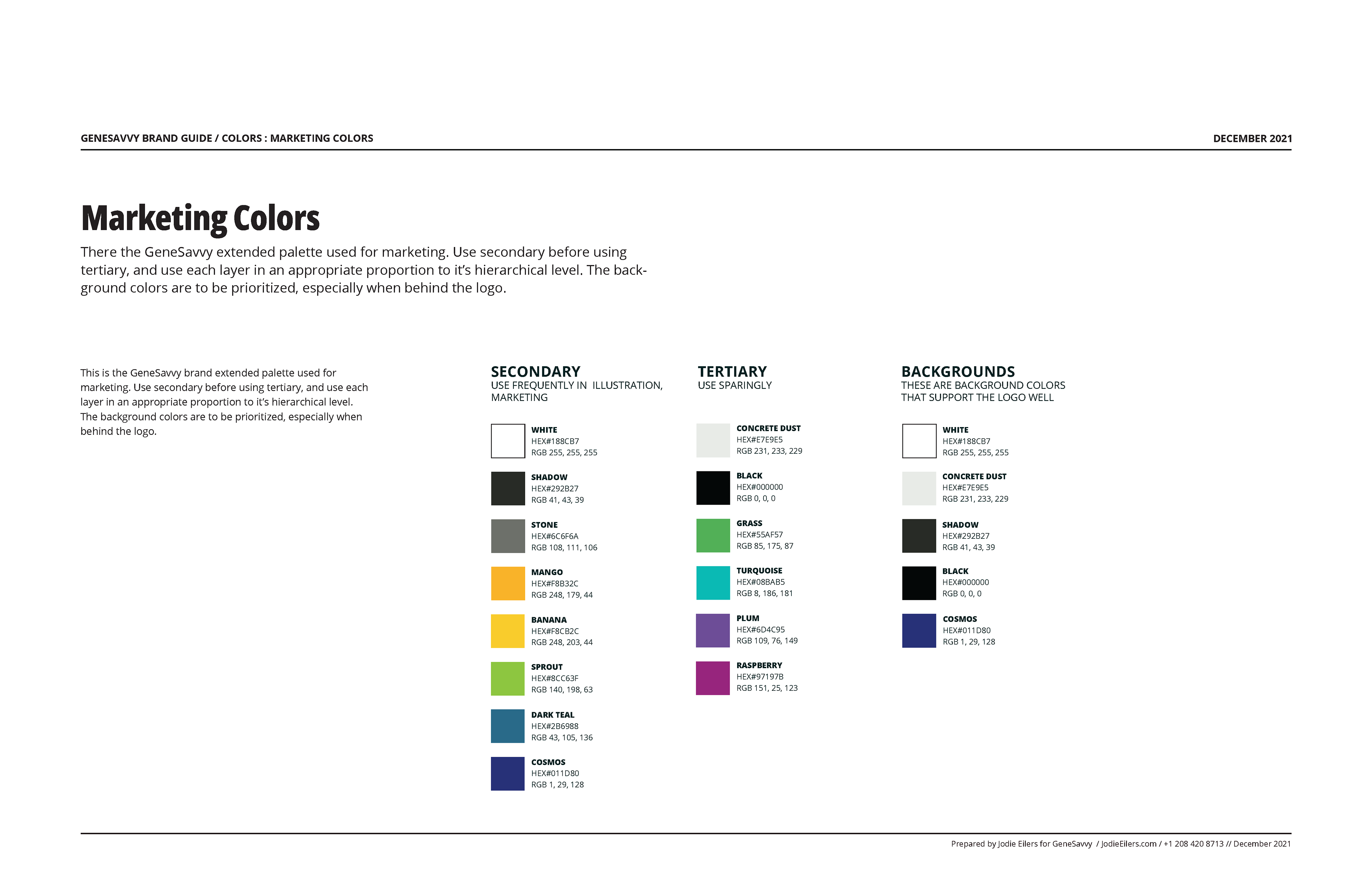
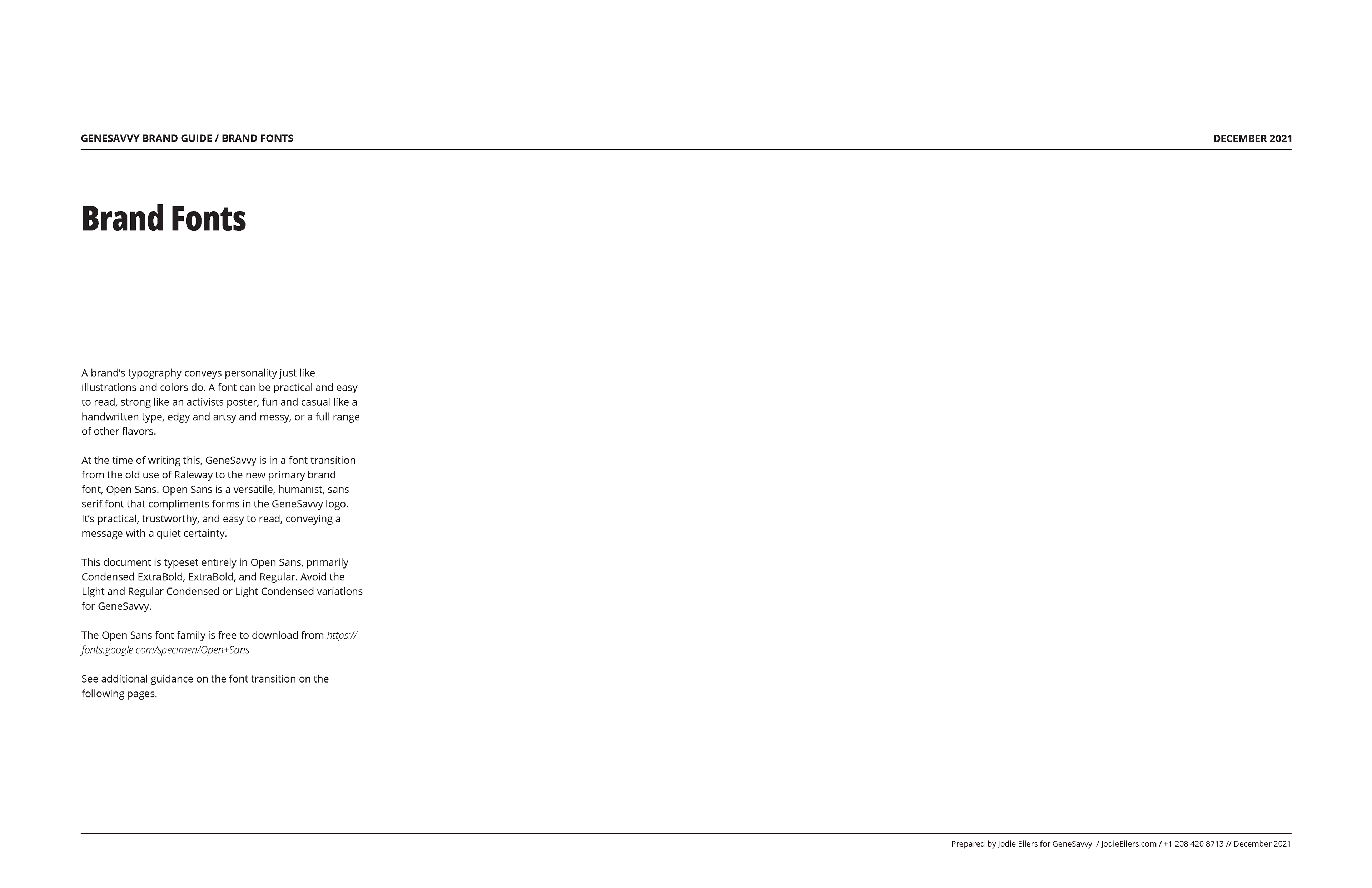
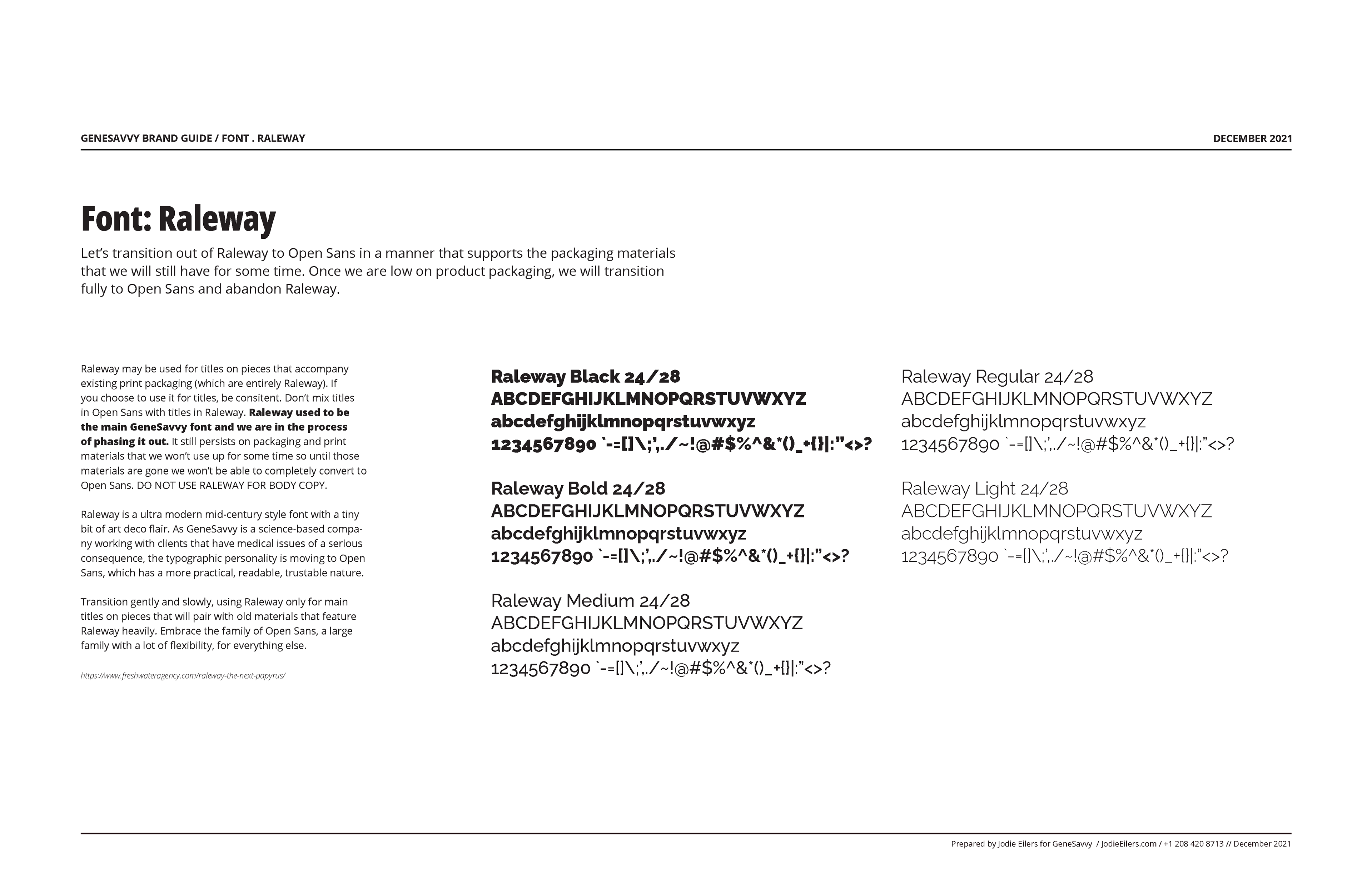
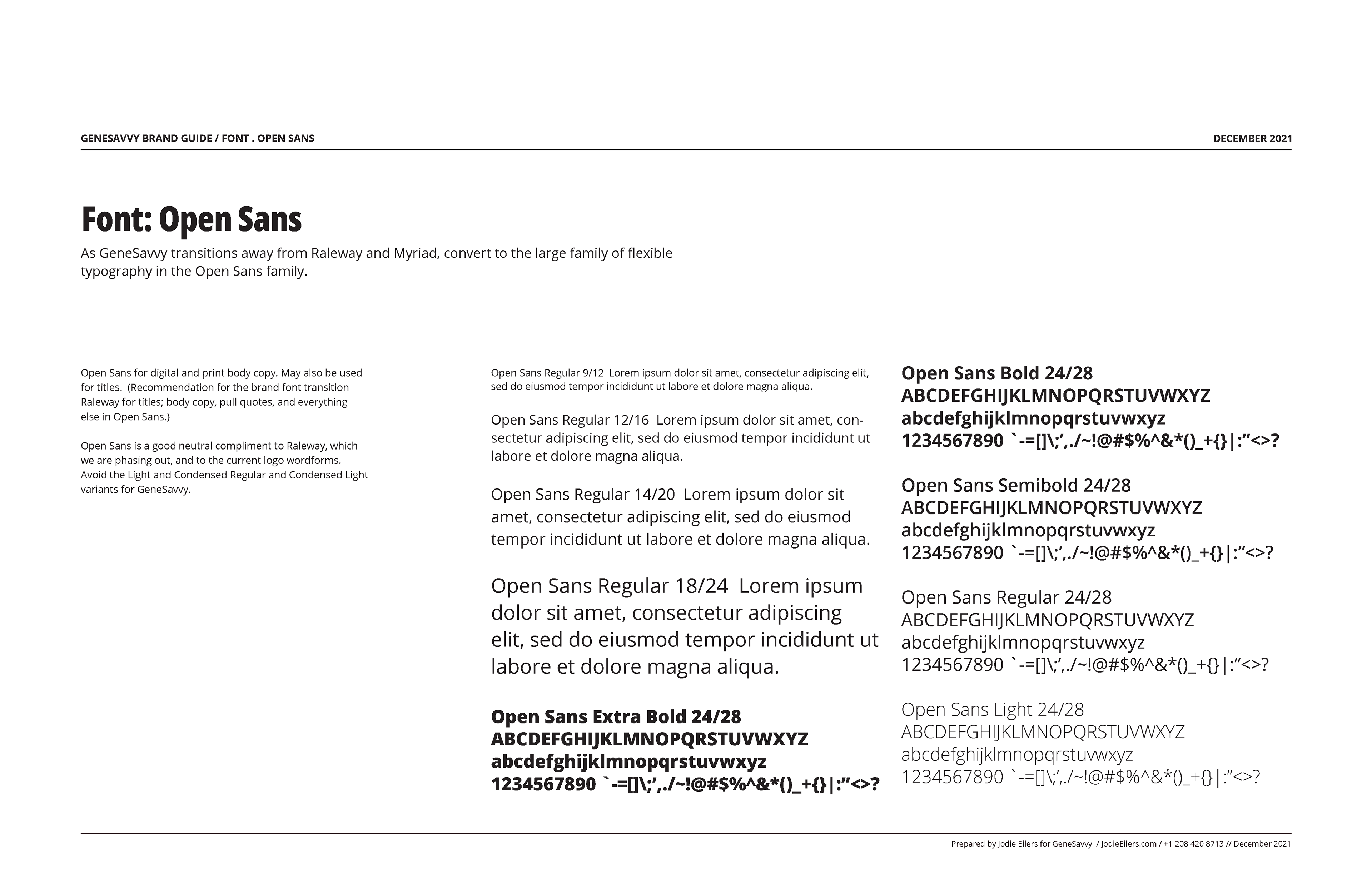
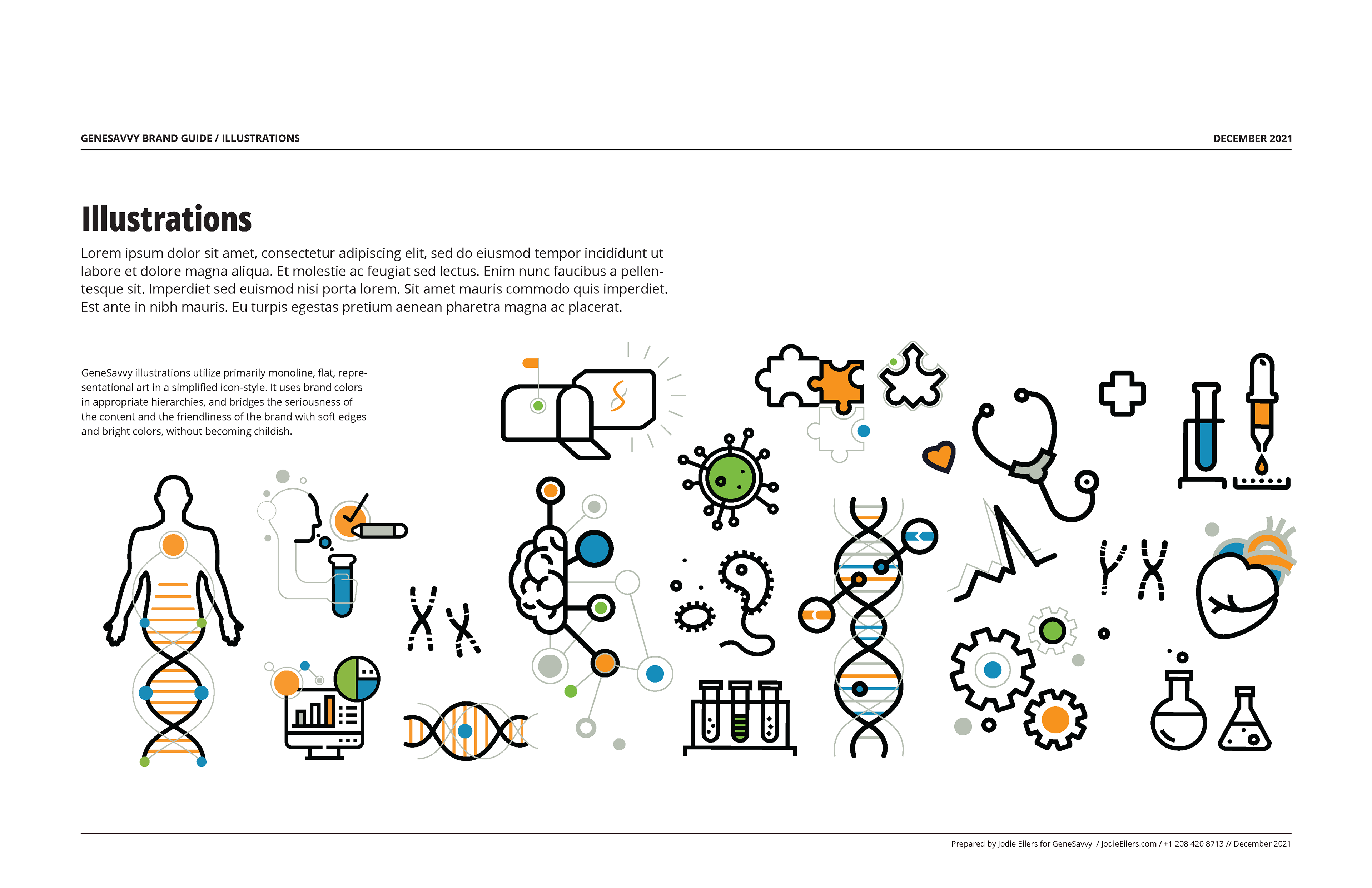
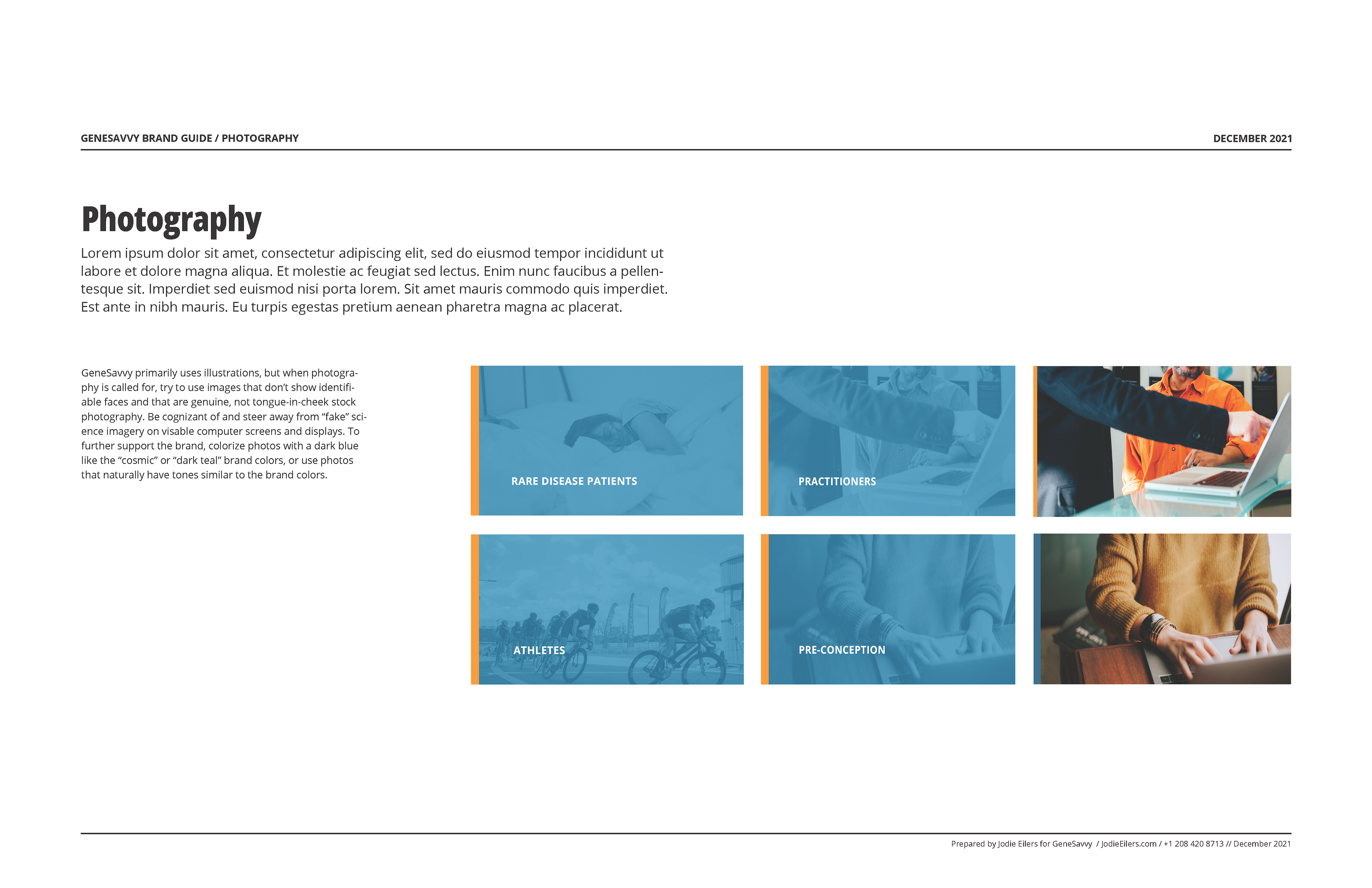
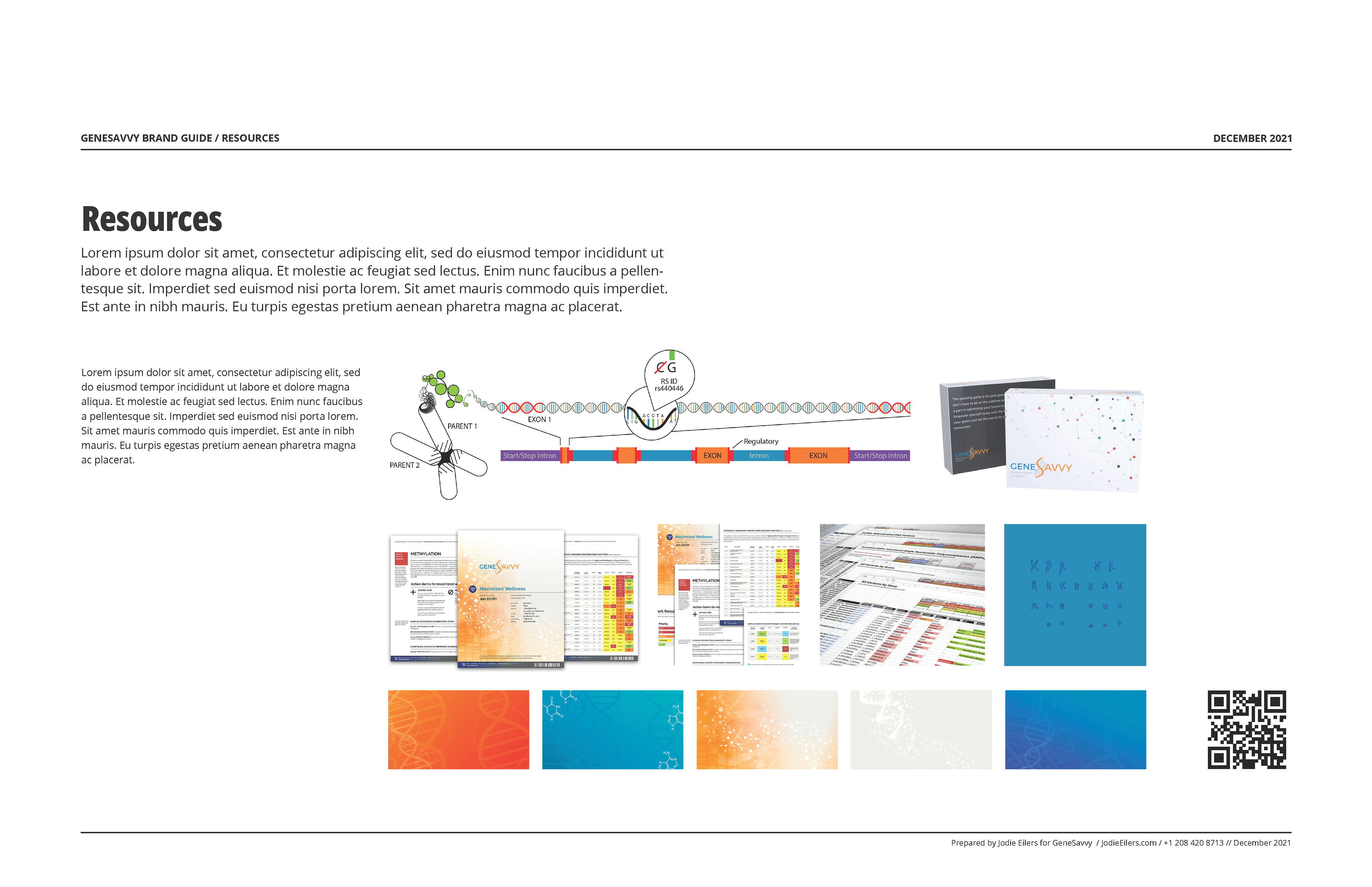
The brand‑guideline pages shown here were created from scratch; none existed prior to this work. Most text has been replaced with placeholder content for privacy. Illustrations were either custom‑created by me or adapted from stock to fit the GeneSavvy style, and all technical illustrations are original. Photography is stock imagery that I edited for a cohesive look and feel. Report visuals shown are from my redesign of GeneSavvy’s core client report.

Caption Lorem Ipsum ali addendum


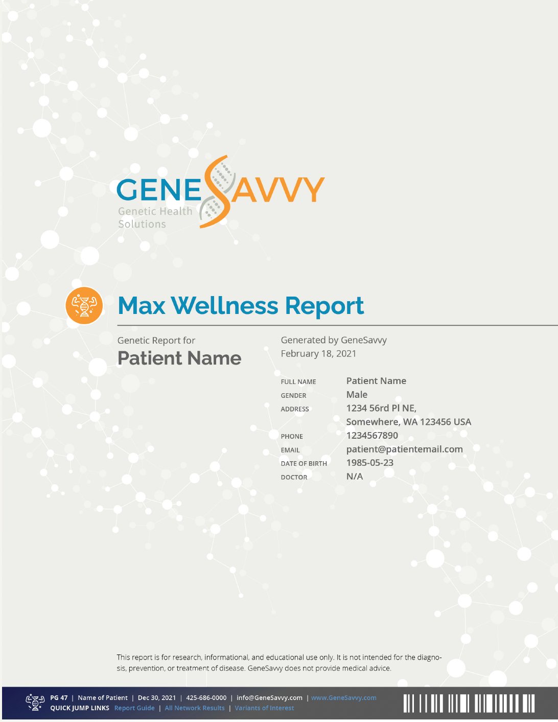
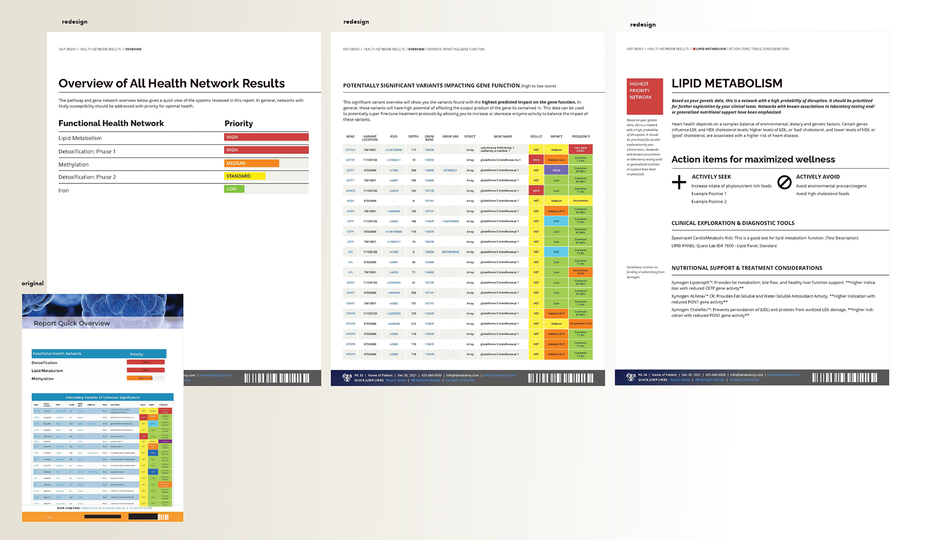
Technical report design
The technical report GeneSavvy delivers to clients and patients contains an enormous amount of information. The original layout used lots of bright, non‑functional color and oversized page elements, which drew attention away from what mattered and made the report much longer than necessary. Because the report is auto‑generated, the design also had to accommodate a wide range of possible results, text lengths, names, and layouts.
Most clients still print these PDFs to bring to their doctors, so page count and ink usage are practical concerns. I stripped out decorative color so that status and issue colors could take center stage, and significantly reduced color on the cover to make printing less burdensome and signal more seriousness and credibility—appropriate for users who often have rare or undiagnosed chronic (sometimes life‑threatening) conditions.
This “Max Wellness” report aggregates all results, with additional reports planned to focus on specific topics. I developed a color spectrum for those future report types and started a system of icons for each, so that colors and symbols could also be reused in website and print marketing. Because this work happened during a brand transition, I selectively used existing brand elements—for example, keeping Raleway as a title font only—while moving the rest of the system toward the new direction.
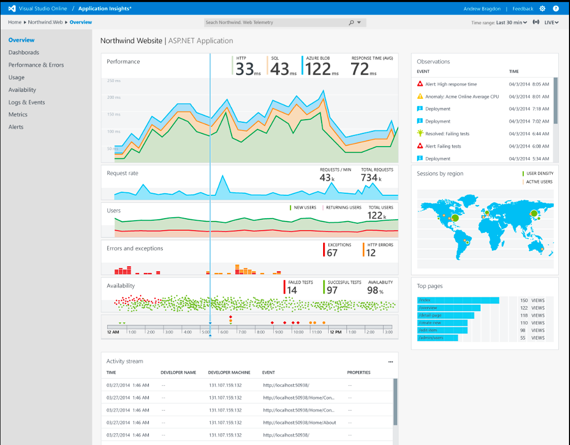
Below, you can see additional pages from the report. In the original version (bottom‑left), excessive non‑functional color and irrelevant imagery took up space and attention. I drew on five years of data‑visualization experience from my work with Microsoft Azure and Excel to reorganize and clarify the data, making it easier for both practitioners and patients to scan and interpret. See my work on general data visualization projects or Azure Portal tiles.
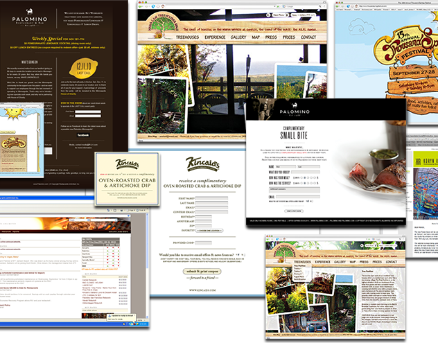
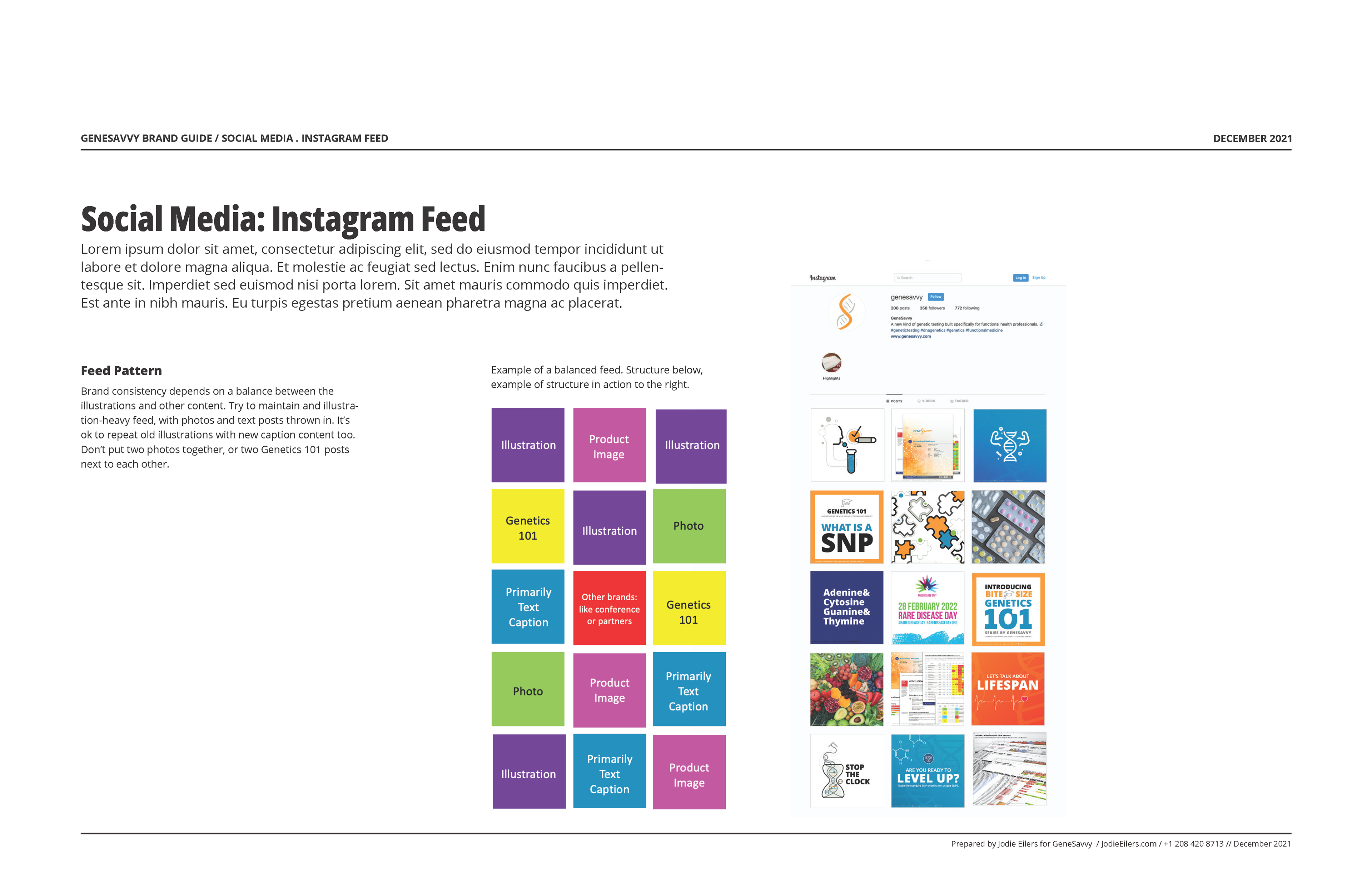
The day‑to‑day design needs at GeneSavvy were broad. A typical day might include creating content for the person handling sales, marketing, and social media; collaborating with the engineer on the ongoing design of automated genetic reports and the upcoming client/doctor dashboard; and producing other assets such as ads, presentation decks, or conference graphics like the examples shown here.
Conference and presentation graphics
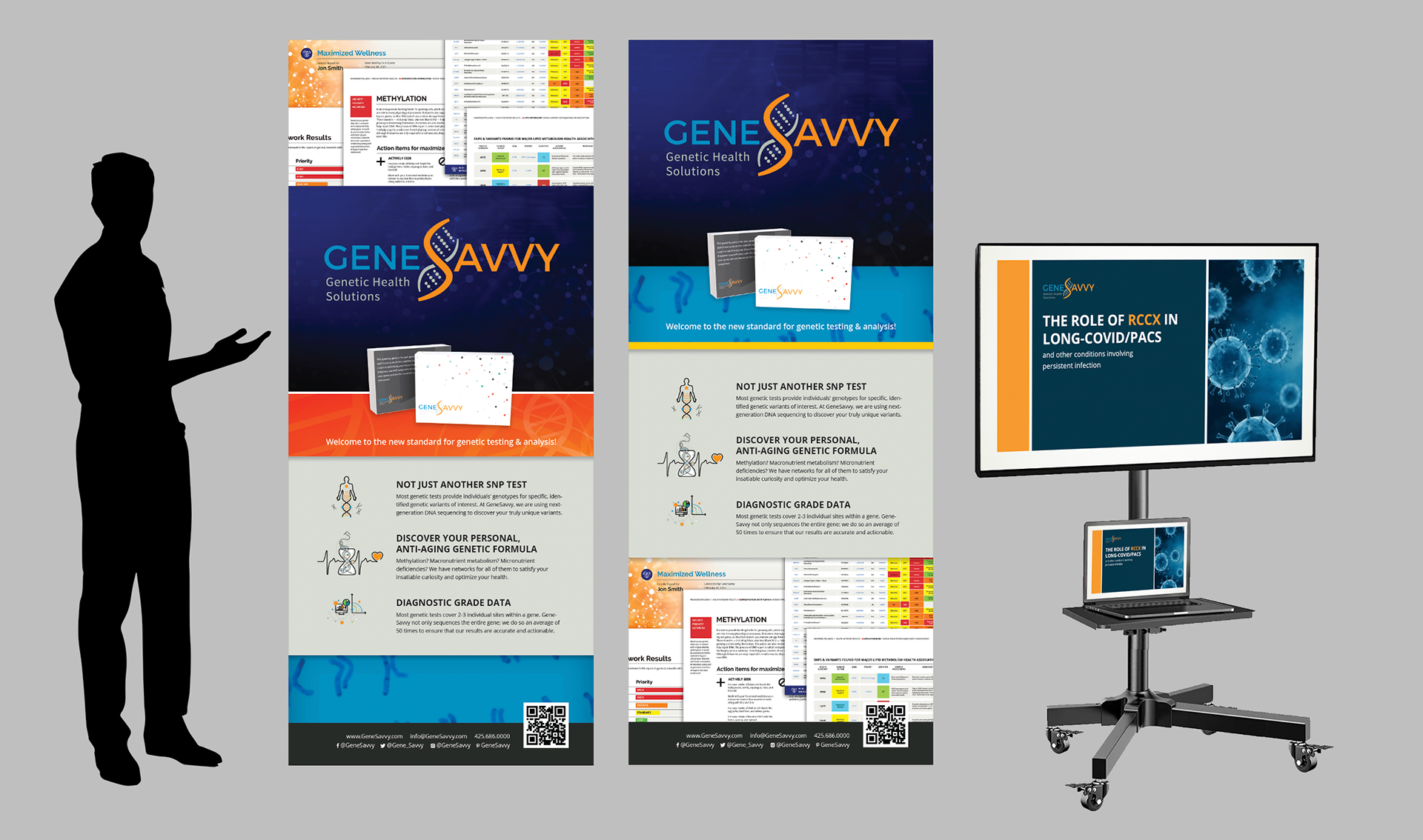
Rollup banners and a presentation for GeneSavvy's first conference presence (low budget).
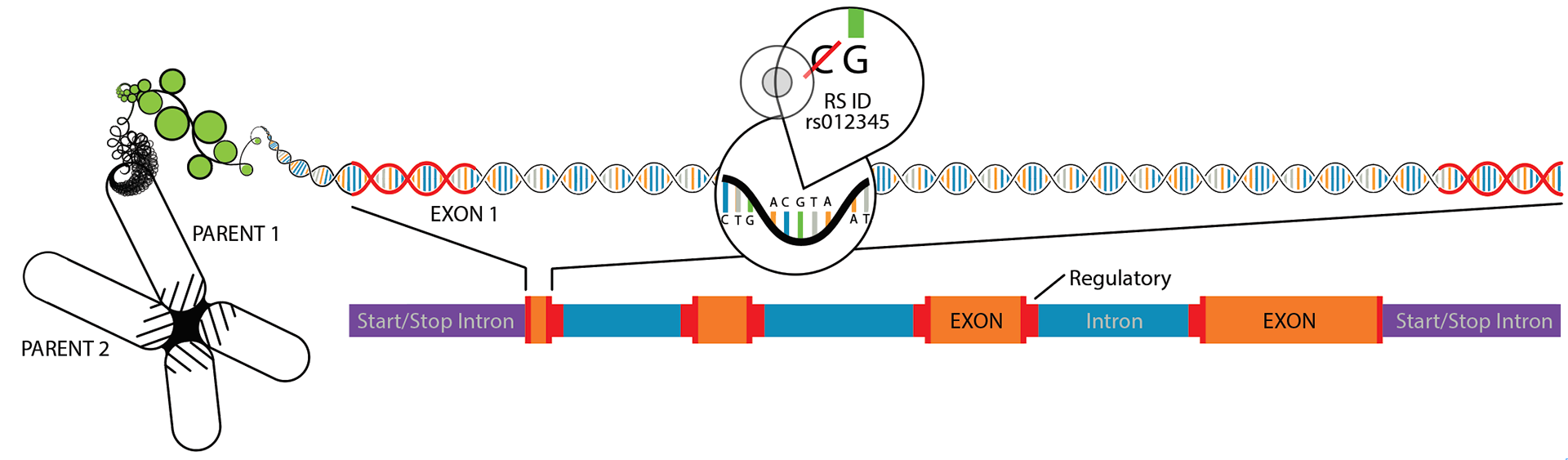
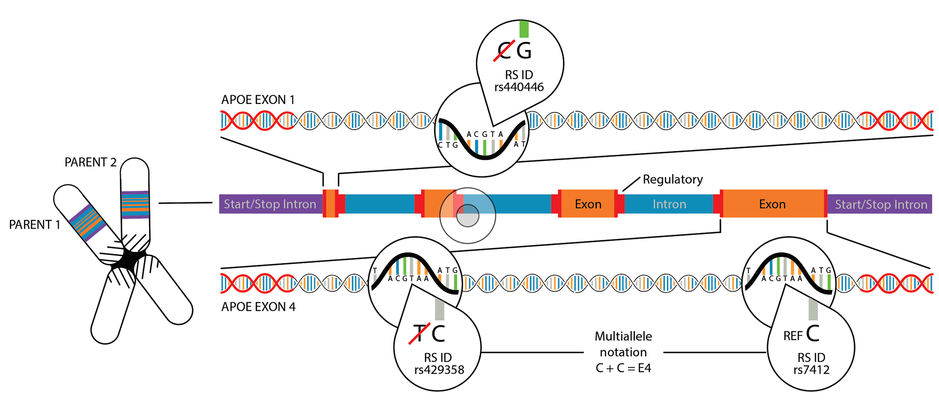
Technical educational illustrations
I also created marketing and technical illustrations for both the reports and educational materials. The illustrations below support the automated genetic report’s educational section, helping practitioners and clients grasp the relevance of their genetic test results and how to interpret key concepts.
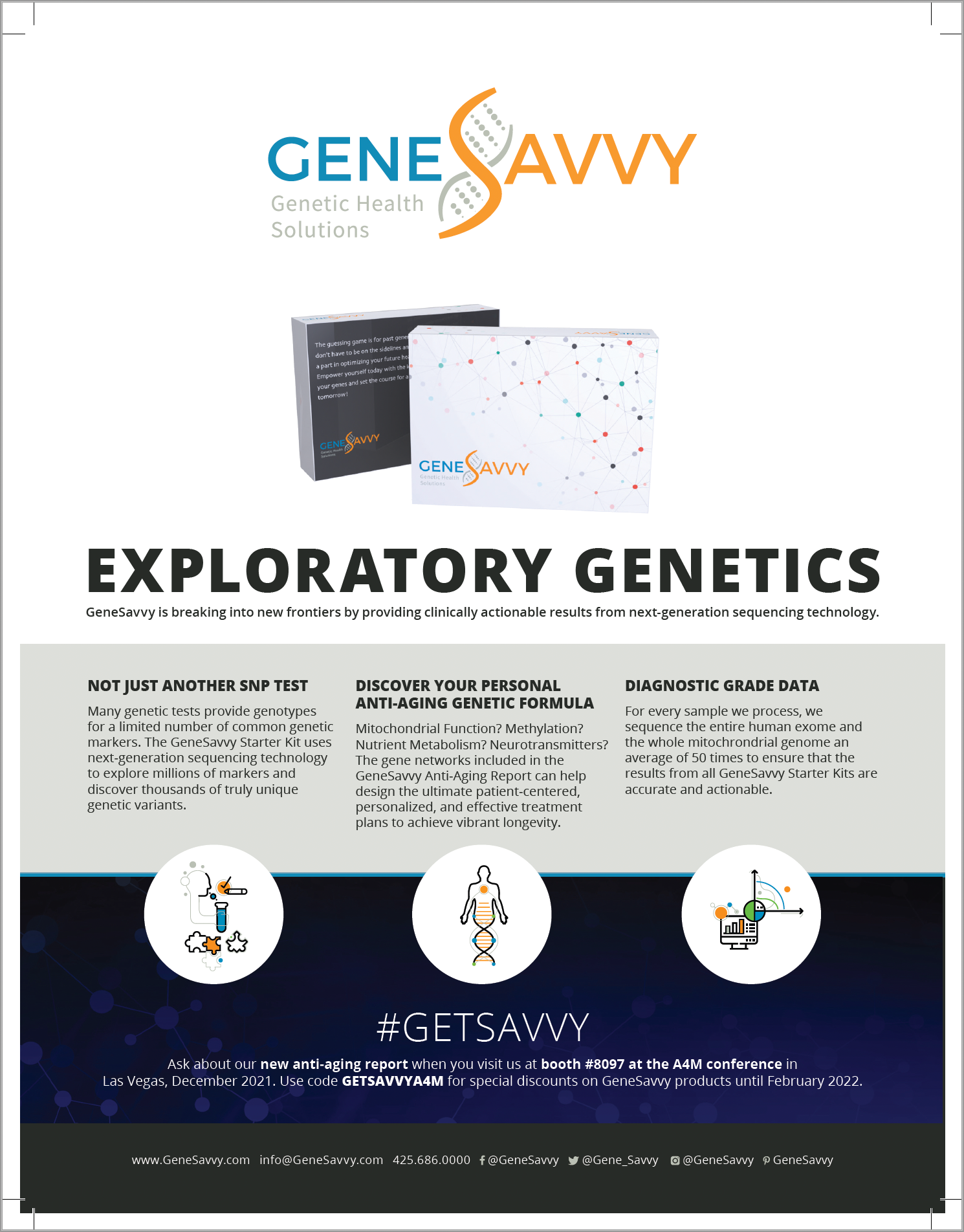
Print advertising
Below is a print ad I designed for a magazine distributed at a medical conference. It features the original packaging alongside transitional brand elements. Because GeneSavvy still had thousands of units of legacy packaging to use before fully transitioning, we relied on subtle shifts in illustration, color, and typography to evolve the brand in public‑facing materials while honoring existing inventory.
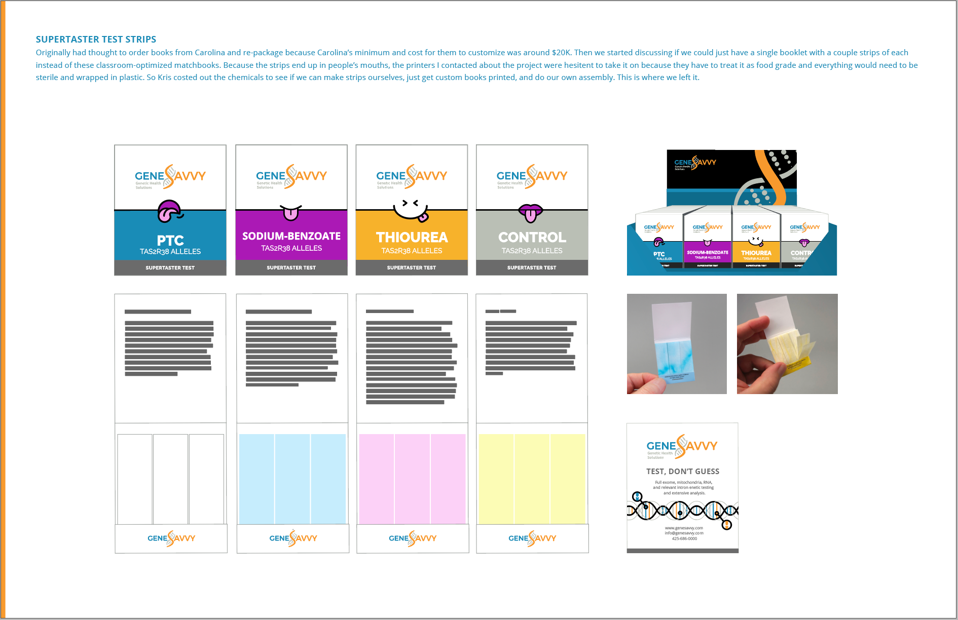
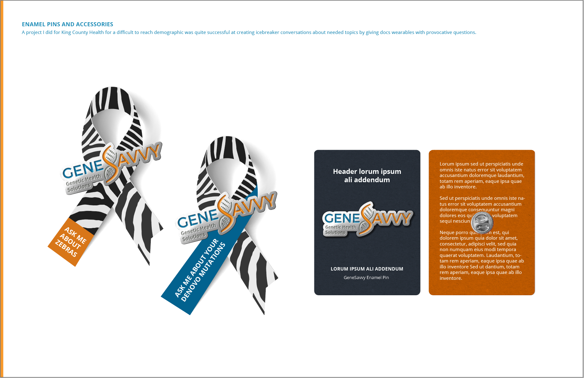
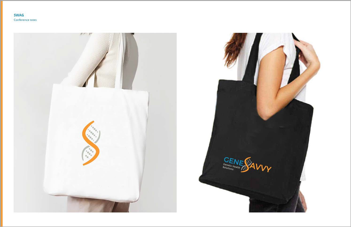
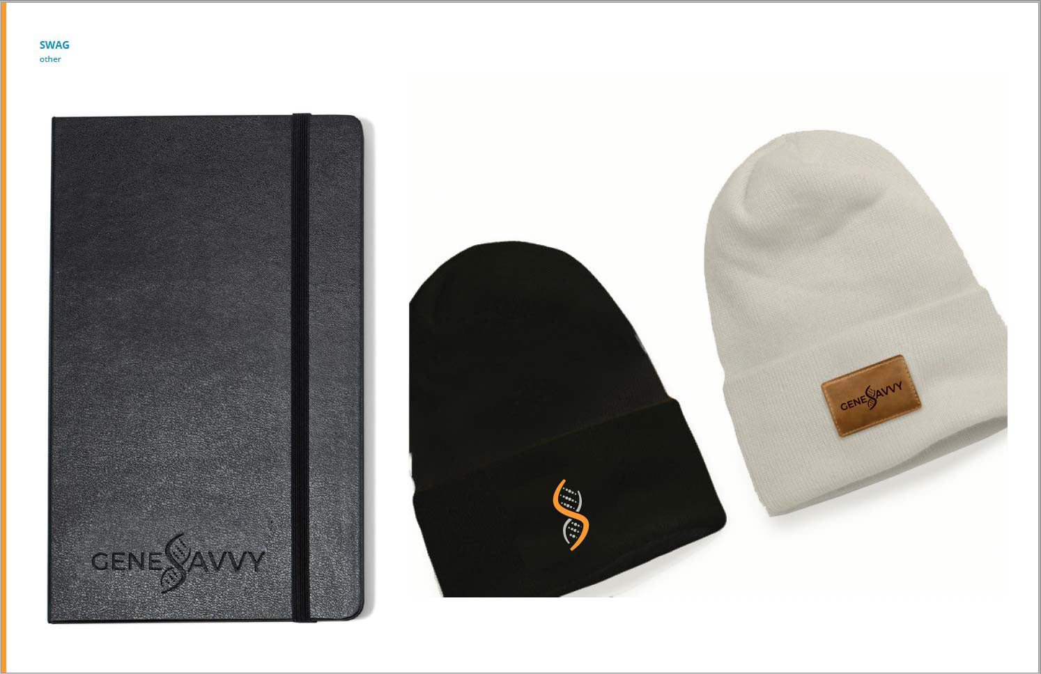
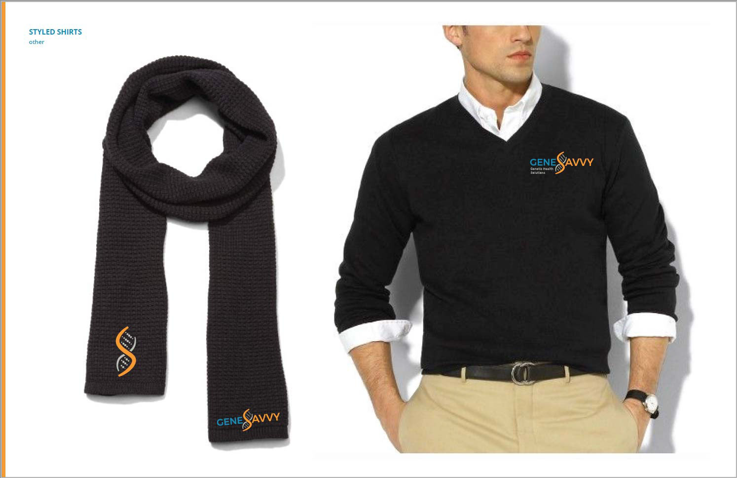
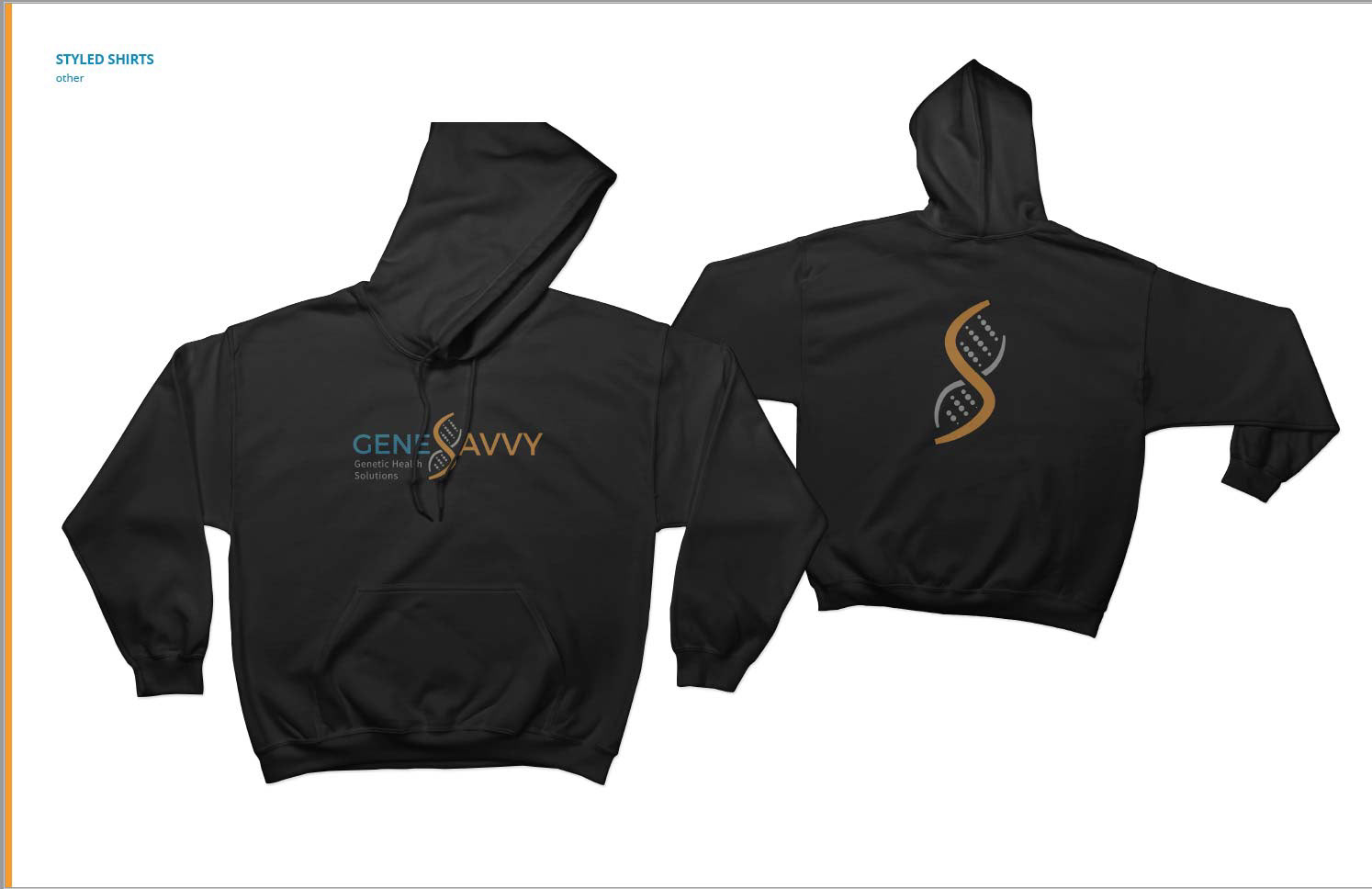
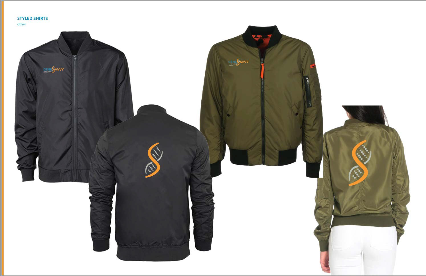
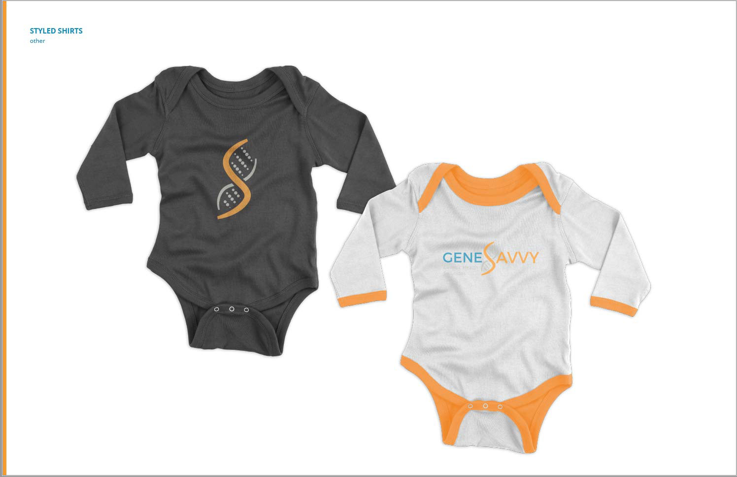
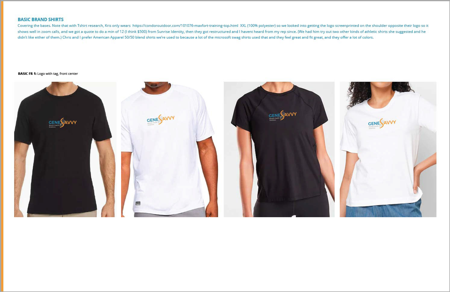
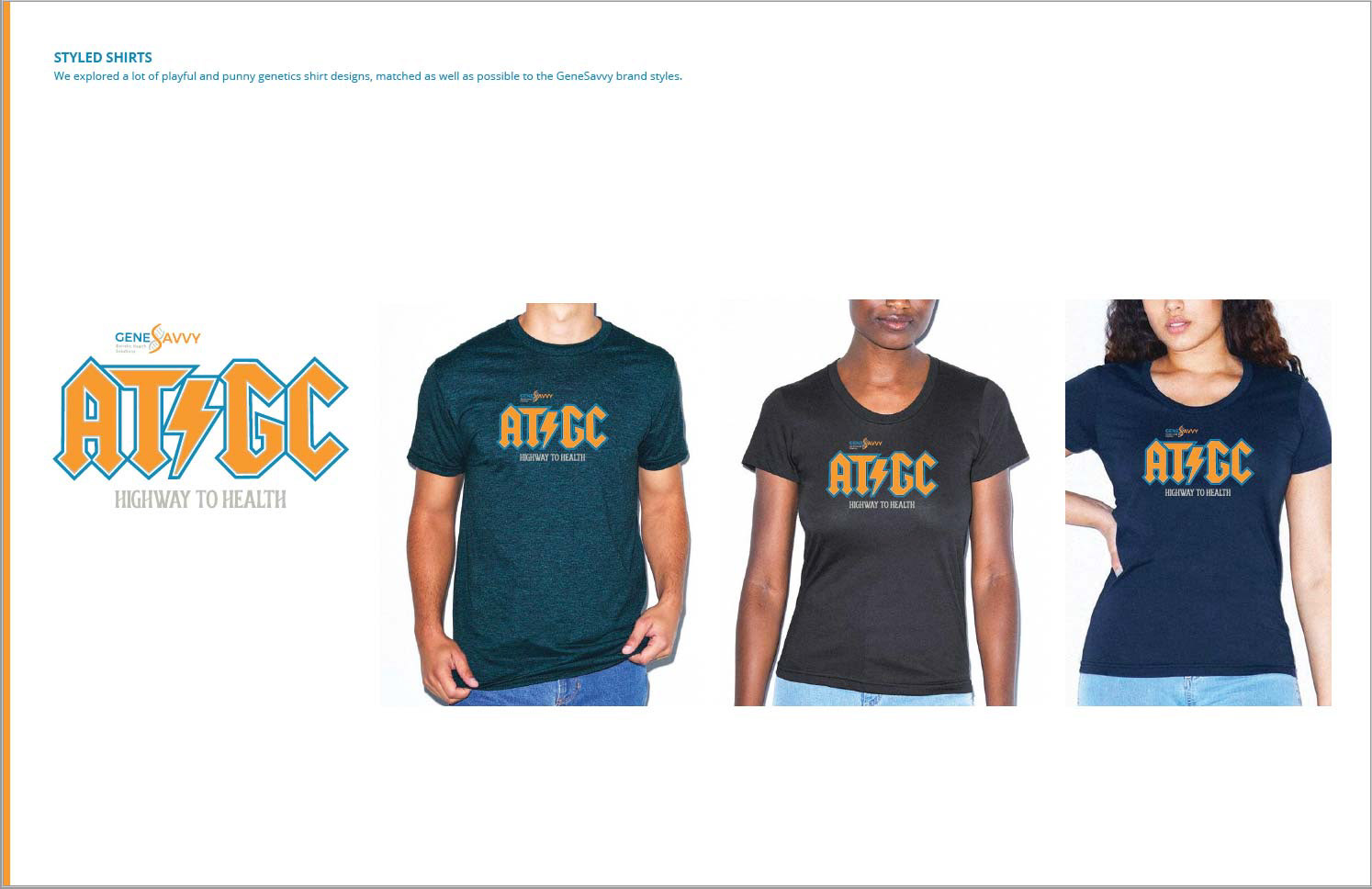
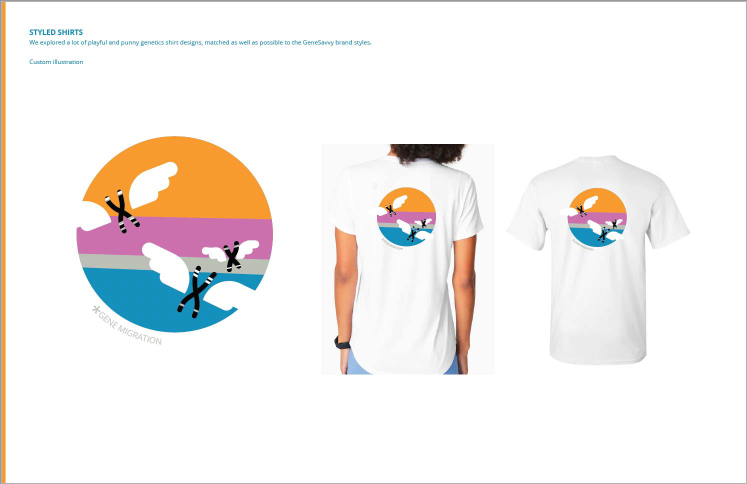
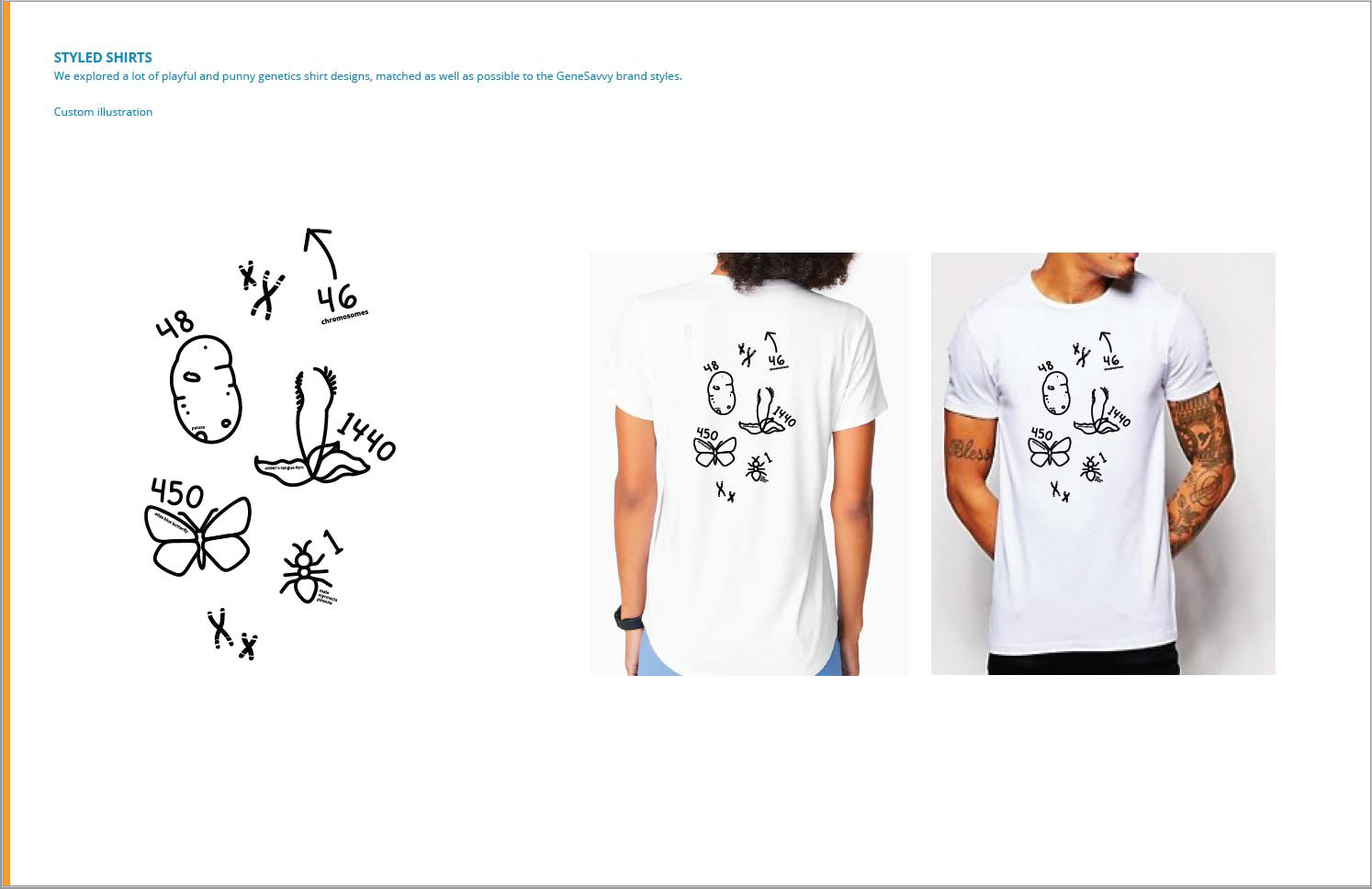
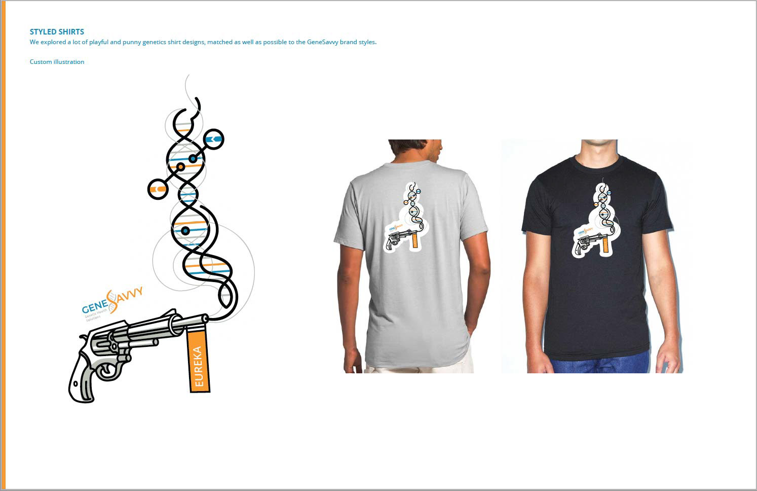
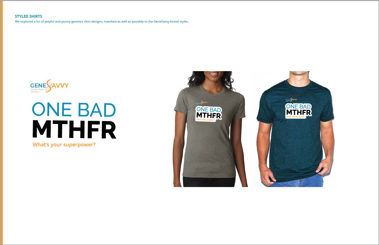
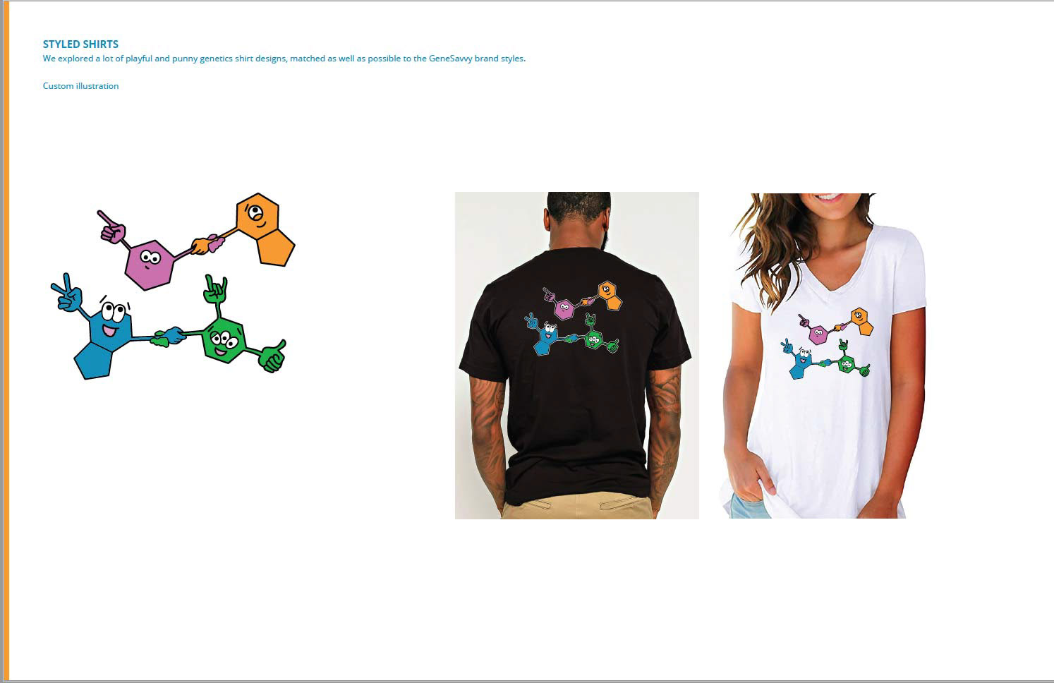
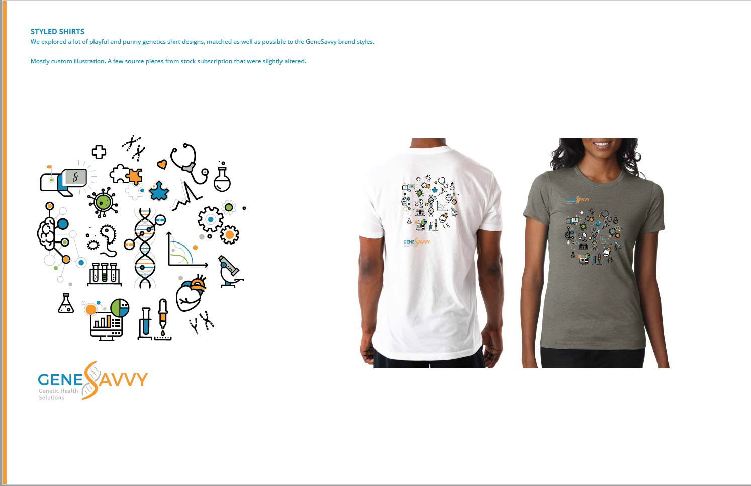
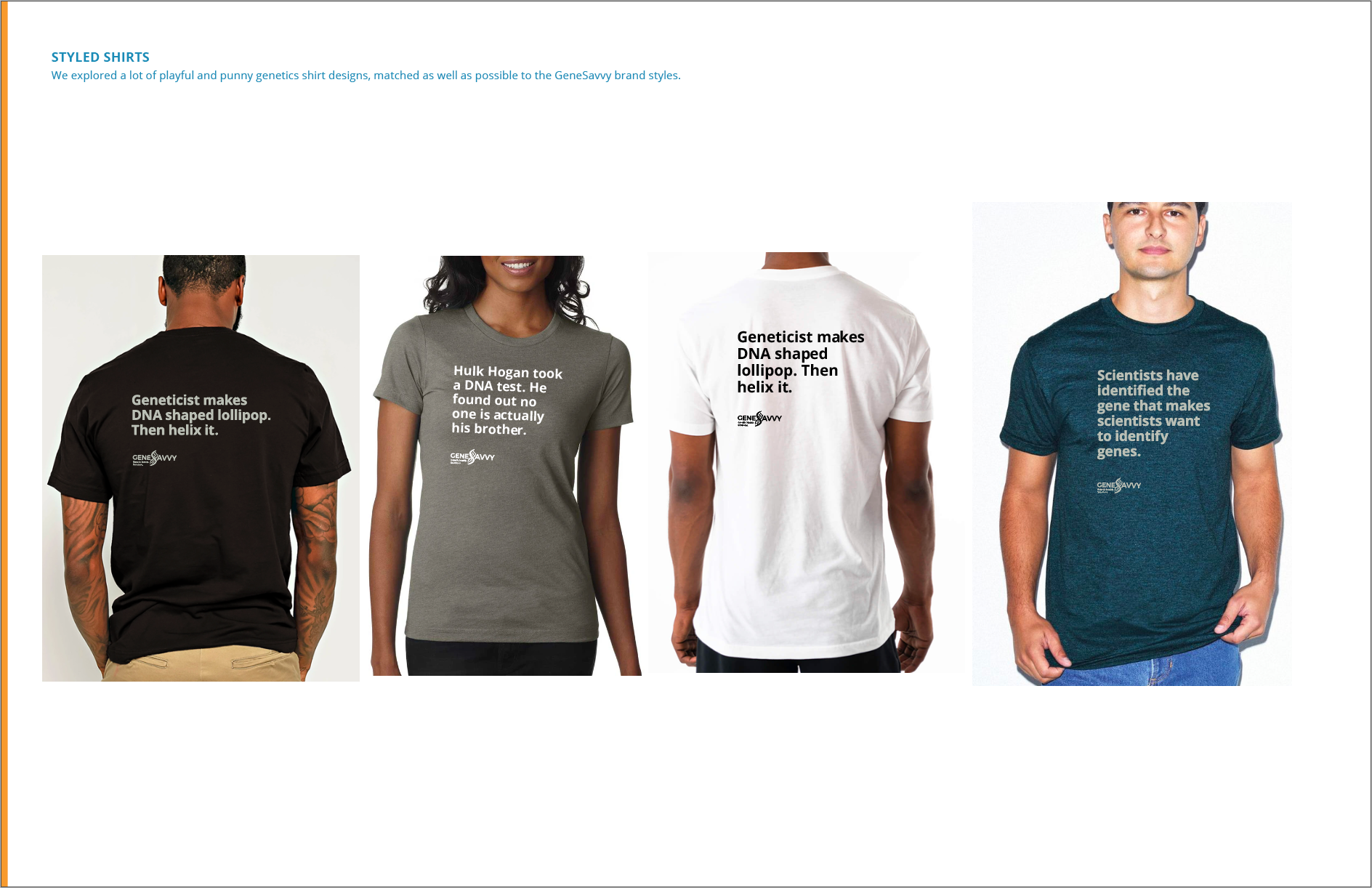
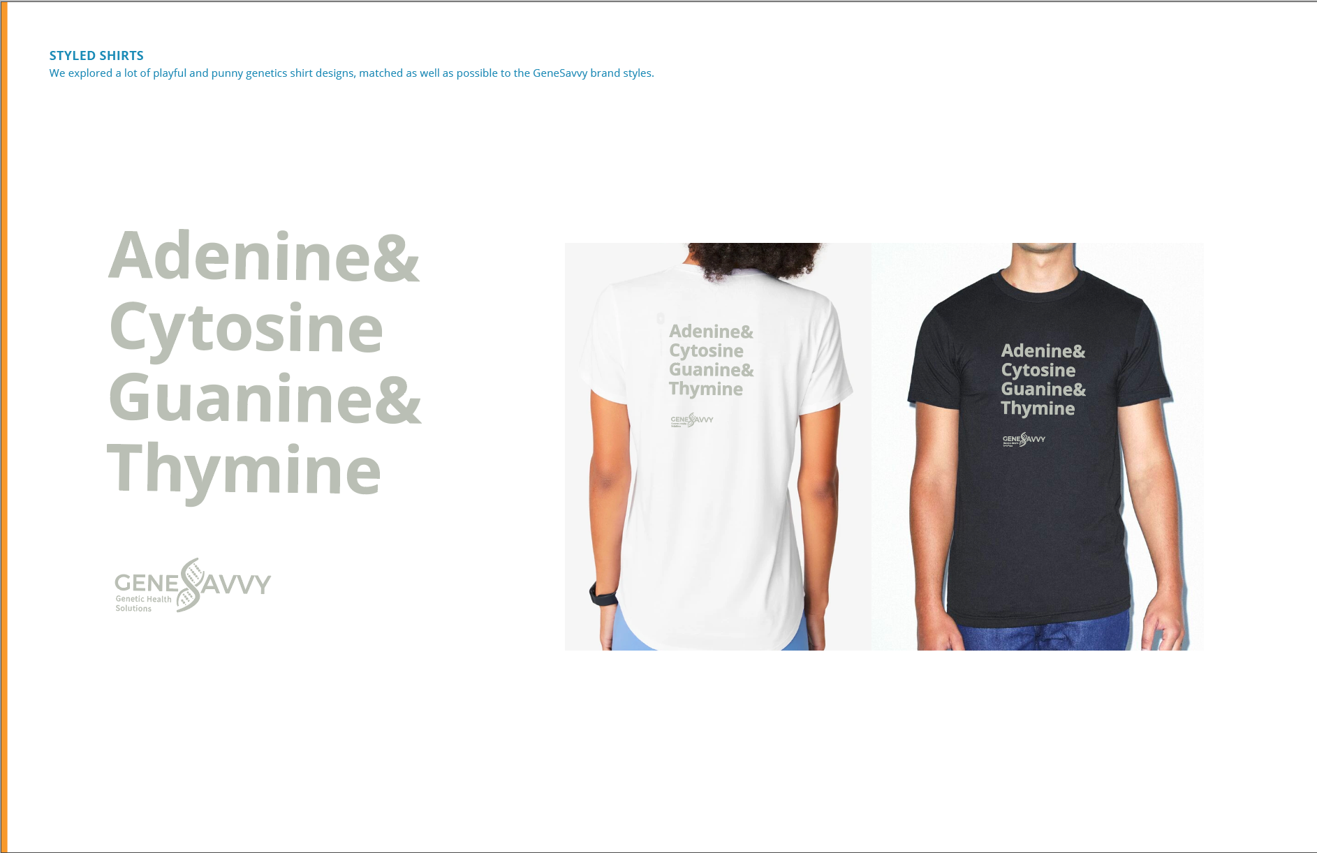
Swag deck page examples